I am a Jamaican, born during the golden years of reggae and early years of dancehall, when the music, according to my uncles, was at its best. I myself wasn't fully aware of dancehall until I was in High School, when I could kind of understand what the music was about. Reggae was still going strong, still popular, but I was not that into it, I thought it was mostly for old people, my father’s generation.
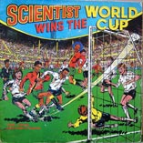
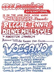
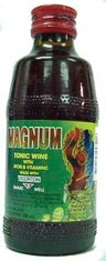
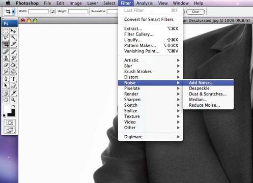
Living in Jamaica, reggae and danceHall are not just music genres, they are ways of life. And even if they are not your ways of life, you are bombarded with reggae and dancehall iconography and imagery constantly. From session (party) posters, where these posters are screen printed with one, two or three colours fading into each other, to tee-shirts, and product packaging. (As shown below)
What I can point out to you though, is that the artwork and music was (and in some cases still is) very COLOURFUL, VIBRANT and ORIGINAL .


Step 1 - Research, Research, Research
I cannot express enough the value of research and the gathering of information before tackling any design challenge. The more you know about what you are being challenged to do, the better the results will be once you have completed the task. Successful design starts with an informed Designer.

So for this particular design challenge, inspiration was not too hard to find, because it is all around me, it's my culture. But for those of you who were not lucky enough to be born and grow up in Jamaica, Crestock.com has provided a very authentic array of design content depicting our music’s journey through the decades, via the reggae and dancehall album covers blog post they have published.
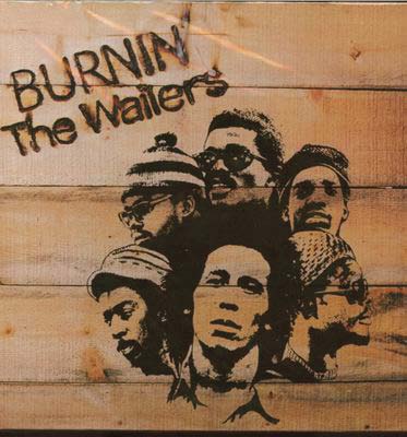
For this design that I'll be demonstrating, I was heavily inspired by the cover of The Wailers' "Burnin" album.
I loved the boldness of the faces and how they are laid out on the wooden background. The background gives it a very rustic - authentic - Jamaican feel. The actual branding of the album title is placed dynamically above the image. The work is simple, to-the-point, very effective. The imagery and type of choice here is timeless and as I said earlier, very inspiring to me.
Step 2 - The Source Images
I start by examining the source photos. I basically just stare at them for hours until I see some thing (worth while) in my head. It is usually garbage at first, but ultimately the good ideas start flowing in. Usually what helps in these critical initial stages, is figuring out what you want to say with this particular design.
Step 3 - The Background
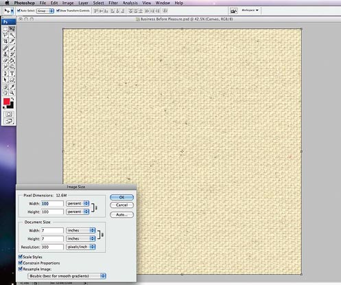
I start by a sizing the work area, mine is 7 x 7 inches, which just happens to be the right size for a 7" vinyl record. The resolution is 300 dpi, that's my default setting since it is the standard resolution for offset printing.
I then locate my background image. It is a piece of canvas, off white, not too white, not too dark. You can either look up Crestock for some background imagery or you could scan in or take a photo of some canvas, if you just happen to have some lying around. I use canvas because when I adjust the contrast and exaggerate the tones it will look more vivid and slightly old.
We achieve this look by:
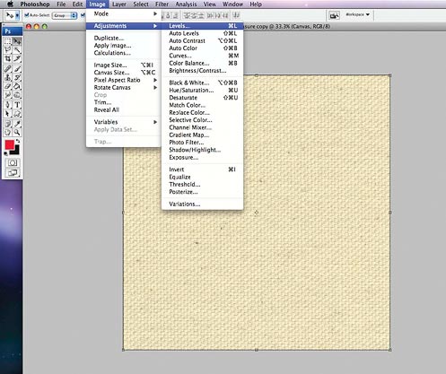
Going to, "Image » Adjustments » Levels", or simply press command L.
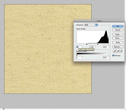
Then Adjust the shadow input level ( The black toggle to the left) until you get a slightly more contrasty image.Now to get the background to feel more worn...
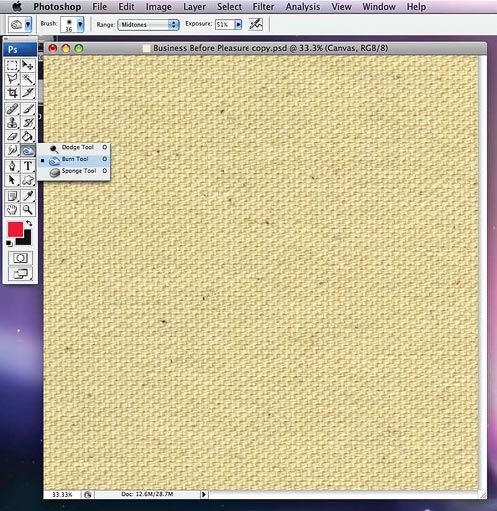
... We use the "Burn Tool".
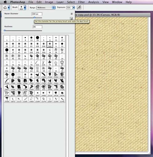
Go to the top left hand corner of the screen, click the blue arrow pointing down at the "Brush Section" Then select the "Soft Brush" preset to 300 pixels. Ensure "Exposure" is set to 50%. Set "Range" to "Midtones".
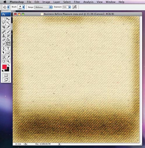
Now paint around the canvas background to apply some "burns". If you want, you can duplicate the canvas layer by using "command + J", in case you make some mistakes on the first layer.
Step 4 - The Central Figure
The main character (focal point) of this piece is "Mr. Music". Mr Music will be a juxtaposition of the typical businessman image and a radio. The image will be heavily distressed with a half tone effect, to give a screen printed look to the overall feel we are trying to capture. This is how we achieve this look:
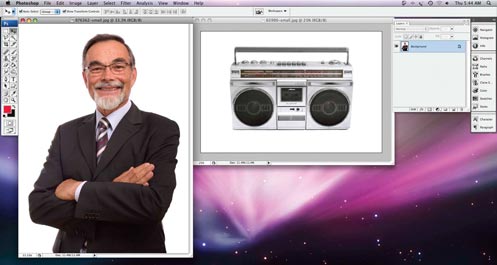
We start by opening both images and giving them a good look over before we begin. We are going to give both of them the exact same feel, but we will be working on one of them at a time. So minimize the radio and let's go.
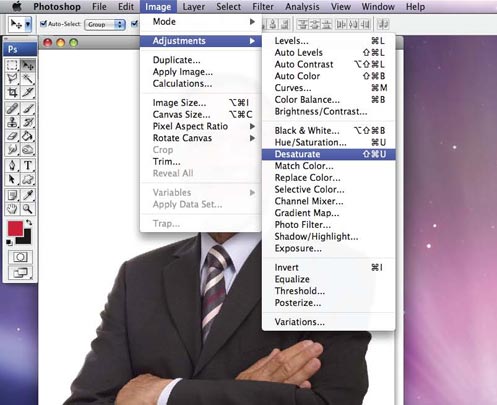
Go to "Image" "Adjustments" "Desaturate" or do "Command + shift + U" (or CTRL + shift + U on a PC). This gives you a desaturated Black & White image.
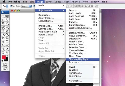
Go to "Image » Adjustments » Shadow/Highlight"
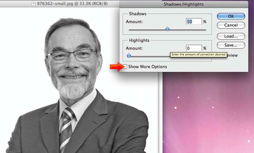
In the dialogue box, first select "show more options" to extend the range of options.
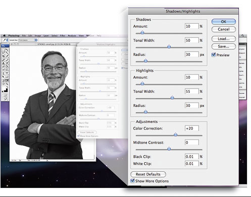
You should add the numbers you see here. This is done to balance the tonal values of the image. You could also use the "Image » Adjustments » Curves" function to do this.

Now re-select the burn tool, and set a "Master Diameter" between 100 and 150 pixels. Use the soft brush and leave the "Hardness" at 0%. Leave the "Range" set at "Midtones", then set "Exposure" to 10%. Zoom in and begin to darken the shadow areas anywhere his jacket has wrinkles or folds, by "burning" them.
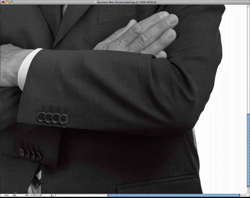
I do this to ensure that we have a good, strong contrast in the features of his dark jacket, so that when we further degrade the image, it will still have a strong tonal range.
This may take a while, but do it all around the image to ensure that the shadows are well defined and darkened. With the exposure set at a low 10%, it's not so easy to see how things are progressing, so I adjust the brightness of my screen to see the progress more clearly.
We now go to "Filter » Noise", then to "Add Noise".
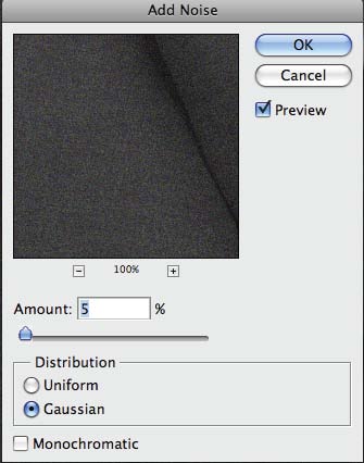
... put "Amount" to 5, select "Gaussian", then click "O.K".

Then go to "Filter » Blur » Gaussian Blur", set "Radius" to 1 and click "OK". This will smoothen the noise effect a little.
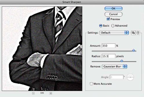
Go to "Filter" again, this time "Sharpen", select "Smart Sharpen" and insert the settings you see here. Click "OK".
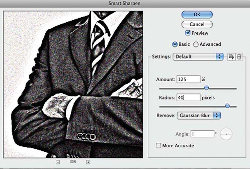
Go to "Smart Sharpen" one more time and distress the image further with the new settings you see above.
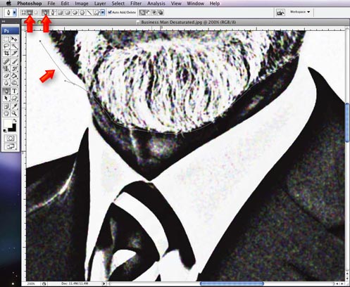
Now we go to the pen tool. We want to cut the head off the business man (as humanely as possible) and swap it for a radio. Look closely and you can see how we try to cut off the head only, leaving the neck intact. We need the neck, so that when we put the photo of the radio on, it'll look half decent.
Note the red arrows at the top; after you have selected the pen tool, make sure that you have the 'Paths' option selected (the first arrow) , and set to use the Pen Tool (the second arrow). A Path is what is created between two anchor points (The third red arrow).
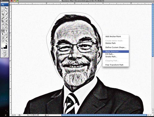
Complete the path by click-linking the last anchor point to the first one made. Then right-click or hold the control button while the cursor is on the line that denotes the path, to bring up the menu shown. Click "Make Selection" and a dialogue box will appear. Make sure the "Feather Radius" option (which softens the selection edges) is set to zero and click "OK".

The selection path will now appear, those little lines that look like biting ants. Don’t be afraid. Just click delete and the man's head will pop off.
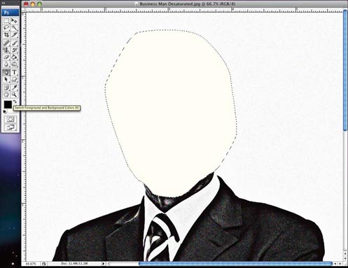
Do a Command + D (or CTRL + D on a PC) to deselect ...
...and the ants / selection path will disappear too.

Go to "Image » Mode", then click "Grayscale". You will then see a dialog box asking you to "Discard color information?" Click "Discard". This is different from the "Desaturate" function that we used previously, which desaturates the colors, but without converting the image from colour to grayscale mode.
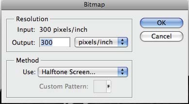
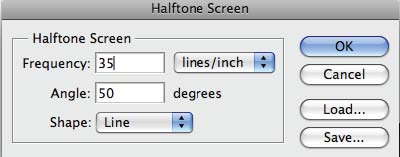
Now go back to "Image » Bitmap" (you can't go straight from a color image to a bitmap) and type in the values seen in the box above. This brings up the box below, again add the values shown here.

And we have an image that looks like it has been screen printed.
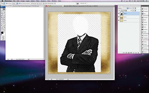
Remember that background we did earlier? Re-open it. Go to "Select » All" to select the entire image, then cut & paste him onto the canvas background. Now to get rid of the white background from the business man image, we will be using the "magic wand".
Now we need to get rid of that background. There are many ways in which we can do this but I’ll show you a quick and easy solution.
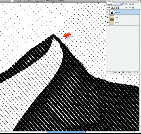
First, we have to ensure that there are no "gaps" in the outline of the figure, like in this image, where the white collar merges with the white background. We select the brush tool, set a suitable diameter and fill in these gaps by simply drawing a line to close them, as shown above.
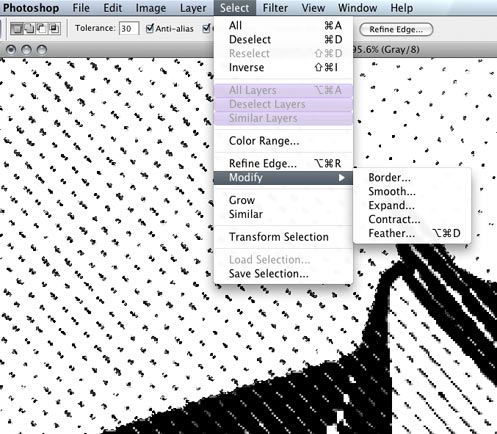
Select the Magic Wand tool, set the "Tolerance" to somewhere between 10 and 50 and click somewhere on the white background to select it. The white background is now selected, but the half tone pattern that covers it is not.
Not to worry; I'll go to "Select » Modify » Expand" and expand my selection by 10 pixels - enough to make all the black dots across the background part of my selection. It has also expanded my selection into the main figure by 10 pixels, so go back to "Select » Modify » Contract" and shrink the selection back by 10 pixels. This will bring it back out to follow the outline of the figure, while the dots in the background remain selected.
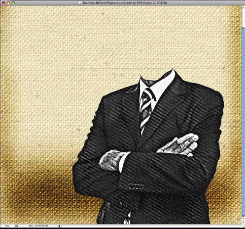
Now that the background is gone, what you have should look like the above.
Like this Tutorial? Make sure to share it with your friends before jumping onto the next page: