10 Famous Works of Art (with client feedback)

Posted Monday, 13 July 2009 by Peter Alexander in Design, Entertainment
If you’re a designer, you’ve probably had to deal with lots of annoying client feedback throughout your career. Let’s face it, a lot of clients have no idea what good work looks like. In fact, I reckon that if the average client was presented with classics of Western art, they’d probably still try to offer up some constructive criticism. And it might look something like this...
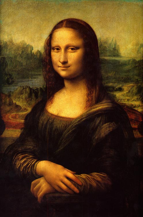
10 - Mona Lisa

Mona Lisa
Client feedback:
We think it would help communicate our superior customer service if we make her a call-center employee, so please give her one of those headsets. Further to that, since she's just helped a customer solve their problem, why isn't she smiling?


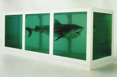
9 - The Physical Impossibility of Death in the Mind
of Someone Living

Damien Hirst Shark
Client feedback:
We love this! So profound, and it really makes you think. But just a couple thoughts: Instead of a shark, can we make it a couple of rabbits? And instead of being dead, let's make them alive. And throw some grass in there so they can frolic.
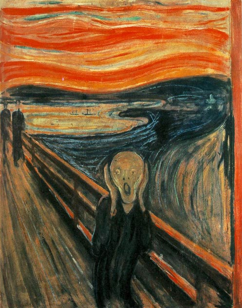

8 - The Scream

The Scream
Client feedback:
From his expression, it's not totally clear he's screaming. We showed it to one of our HR girls and she said "It looks like he's really tired and having a yawn." So let's add a voice bubble with text that reads "Nooooooo!" (for the text, use Comic Sans).
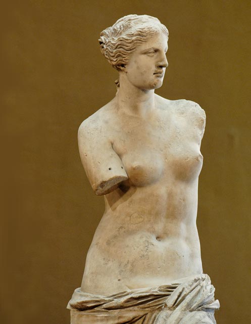

7 - Venus de Milo

Venus de Milo
Client feedback:
Is this even finished? And we'll have to check with legal and get back to you about the nipples.
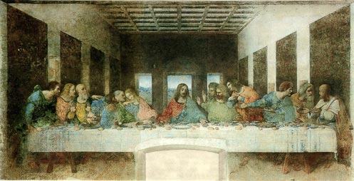

6 - The Last Supper

The Last Supper
Client feedback:
Our customers are both men and women, from a wide variety of cultural and socio-economic backgrounds, and we feel this doesn't quite reflect that. As such, please adjust your choice of models to include one MILF-type with a baby stroller (young, urban mothers are one of our biggest demographics), a man in coveralls with a hardhat, an Asian (doesn't matter what type), and a Native American. Oh, and make that long haired metal dude in the middle black.
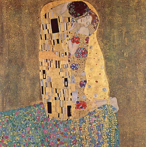

5 - The Kiss

Gustav Klimt - The Kiss
Client feedback:
We have two words for this: Not hot. Let's see some skin. Try another revision, with her in a red lace bra and thong.


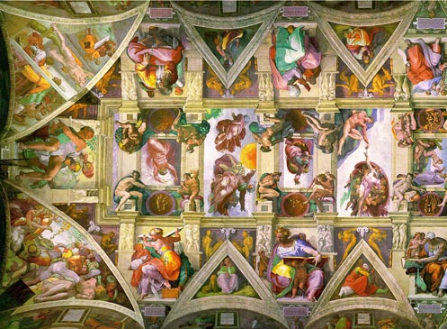
4 - Ceiling of the Sistine Chapel

Sistine Chapel Ceiling
Client feedback:
We appreciate your hard work and dedication as you worked on this these last four years. Unfortunately we only budgeted 20 hours of design for this project. So we'll have to ask that 35,043 hours of your work be pro bono.


3 - Guernica

Picasso Guernica
Client feedback:
We like the direction you're going with this sketch, but we thought you were presenting finished mock-ups today.


2 - The Thinker

The Thinker
Client feedback:
We want to improve conversions by making things more interactive. So please add a poll question to this, with the following text:

What's he thinking about?
a) Who's going to win "So You Think You Can Dance"
b) Where he left his pants
c) Whether there's any more toilet paper
d) God that Venus chick's got an amazing rack - wonder what line I could use to pick her up?


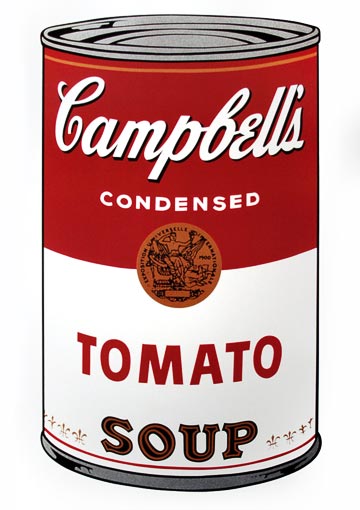
1 - Andy Warhol's Campbell Soup 1, 1968

Warhol Campbell Soup
Client feedback:
Make the logo bigger.


Other great posts you'll enjoy:

» Another 23 Signs You're Becoming a Design Geek
» Top ten gadgets every designer SHOULD live without
» 10 Stock Photos That Just WON’T Sell!

Weekly Free Stock Photo The Weekly Free Stock Image
We are giving away a free, high quality photo every week! Get Your Image

Comments:

the last one made me laugh out loud
By scaramond on Monday, 13 July 2009 8:55 PM
i've had that so many times!
Campbell soup??
By VanillaGorilla on Monday, 13 July 2009 10:06 PM
Why dimune these works of sheer art by catergorizing them with a can of campbells soup? Madness.....
Dumbass
By SYX on Monday, 13 July 2009 10:12 PM
The Campbells soup is an Andy Warhol
Excellent
By Laughing on Monday, 13 July 2009 10:24 PM
They're all good but I love the last one. No matter how creative the concept and balanced the design is, the client always wants their logo to be bigger.
And?
By FZE on Monday, 13 July 2009 10:24 PM
Still a chuffing soup can. Even having Warhol in here is an insult to the other 9 artists.
Wow!
By Mickey on Monday, 13 July 2009 11:16 PM
You nailed it! Those are the cliches that are used so often. I had a nice time reading it, but can you please made kerning on letters more subtle and please try some different approach to the subject, something like they use on McDonald's commercials or maybe try KFC way.
Here's one I've heard several times
By Timmy on Monday, 13 July 2009 11:36 PM
Can you make the yellow not quite so yellowy and more like a reflective gold?
Ignor - ance
By Walter Paul Bebirian on Tuesday, 14 July 2009 9:10 AM
the best thing to do is to have enough confidence to ignor - the ignorance that comes your way - :-)
Ignoring the ignorance...
By ssjothun on Tuesday, 14 July 2009 9:47 AM
@Walter: That is some times true, but the problem is, as you're probably painfully aware of, when the customer ends up totally butchering a nice, effective design.

This raises the question: How can you as a designer or information architect, convince the customer that what he/she is proposing is utterly, devastatingly wrong and will have a negative effect on their business?

Sverre Bech-Sjøthun
Internet Marketing Director

www.crestock.com
Make the logo bigger.
By Gunnar Andreassen on Tuesday, 14 July 2009 12:01 PM
Sometimes it seems it is never big enough.
warhol on a can
By Heidi on Wednesday, 15 July 2009 3:13 AM
but isn't that the entire point? Showing how art IS the message, or art DOES sell product...and how would a PR person criticize perhaps the iconic art of our consumer society, that's been in place for two generations at least...the can stays. It is the perfect finish for this ensemble
no avatar?
By Joey on Wednesday, 15 July 2009 4:53 AM
I like the shark, is it alive? Sistine chapel is good, what a random blog!
We are so lucky to have lived to the age we have.
Its that "I am still above you"
By Sajid Akram on Wednesday, 15 July 2009 10:56 AM
After getting intellectualy defeated, the left-side brain guys throw up suggestions to make a show that they are still above your intellectual level. Where as they should not try the right-side brain activity, it is mostly reserved for the genius.
i'd be rich if i had a dollar every time i heard make the logo bigger
By jerri on Friday, 17 July 2009 12:48 PM
brilliant!!!
Andy Warhol is an artist too
By someone on Saturday, 18 July 2009 7:00 AM
I mean come on, all this art is from different genre so why pick on his art just because its a soup can? Its called pop art. He's just as brilliant as the rest of them in his own medium. I hate it when 'critics' try to know it all. all art is brilliant. case closed
By robb on Wednesday, 22 July 2009 6:56 PM
this is just impressive.
Make the logo bigger...
By Piers on Tuesday, 28 July 2009 8:06 PM
...and can we have that blue more grey?

What sort of grey would you like?

I don't know - you're the designer...
---------------------------------------------------
Yes folks, thanks for that. Laughed out loud at the Campbells as well.

Top stuff!
Seriously?
By Jon on Wednesday, 29 July 2009 12:24 AM
Sure, Andy Warhol was an artist. I have a Marilyn print on my wall. I like a lot of his work. But I've always thought his Campbell's stuff was just dumb.

Art, yes, but he added absolutely nothing to the image. It's practically plagiarism. How he was able to sell the likeness of a trademark for $1500 without triggering a lawsuit baffles me.


On the other hand, the Campbell's soup can designer would make sense in this list; more so than everything else here. The editorial is on commissioned, commercial design, yet every other example here is of fine art.

Andy Warhol's work doesn't make sense here because he didn't do the design that the commentary critiques, but the can itself is the only prime example.

That's not to say I didn't enjoy the others; just that I find it funny that so many are so passionate about Andy Warhol. Seriously, the only thing you could critique about that was the perspective of the can. "I'd like it more straight-on so we see less of the top of the can." Beyond that the work isn't his.
well now...
By antwanporvida on Wednesday, 29 July 2009 5:26 PM
What about artists that paint cityscapes, or architecture? The original work is not there own, but yet they use it for subject matter. El Greco, Claude Monet, Paul Cezanne, and even Van Goph have all used other peoples 'work' in order to create something of there own. Claude Monet didn't design the Rouen Cathedral but made it the subject matter of numerous paintings.

So why is impressionism ok, but pop art is not?

Stop drinkin Hate-orade.
Soup
By Glue on Thursday, 30 July 2009 1:51 AM
So the can of soup is an ANDY WARHOL... I did not know that... and I did not know that ANDY WARHOL worked for Cambell's. I think that the whole can is their logo so they should sell bigger cans of soup if they want bigger logos.
Art History Saves Designers
By jennifer on Monday, 3 August 2009 7:24 PM
Well I can say that all Art is beautiful and someone with a very warped mind has made "amusing" comments about all these works of art. Art is to be viewed at with an "open" mind and not to be criticized because "someone" does not understand it. They are all AMAZING pieces and will teach generations different styles and techniques and really add to the value of Art History. What good is a movie if we did not have the knowledge we have from being able to go and look at art from many years ago?
..
By Really? on Wednesday, 5 August 2009 2:20 AM
This is retarded.
art? opinions? I can not like something and still be open minded!
By Erik on Thursday, 6 August 2009 7:27 AM
the Warhol stuff is all crap, sry but that art died before it was made. Appropriate here, most certainly, but art for the masses as he wanted it gets sold at urban outfitters, and I know some very respectable artists that sell their work for t-shirt prints there, they scoff at it, and don't call it art. Imagine the white T, like the white painting, blah, get over it, you might get away with saying it "was" art, but it certainly isn't anymore. That mute point was flushed with "r mutt." Beyond that it was all about reproduction, which is not art unless we look at systems to the liking of what FORD built which still drive our consumer industrial society today, which is like 3-4 other conversations in itself. I won't even go into the painstaking efforts all the artists actually went through in pursuing their aspirations and compare it to mass production.

however, on the contrary, long live The Velvet Underground! The man does have his own genius :)

Awesome post
nice article, and oh so true
By munky on Friday, 7 August 2009 2:26 AM
Have had so many bizarre critisisms from clients from working as 3d artist for tv adverts last 10 years, sometimes ya just want to scream. One that sticks out in my mind was from one of my first jobs, some singing fruits, no arms / legs / teeth / tongue / textures, just fruits with mouths and sunglasses, client emailed me saying i should make one of them look more like clint eastwood.... couldnt explain how in any way just "you know, more clint eastwoody" :) got to love clients.

oh and jon.. "The editorial is on commissioned, commercial design, yet every other example here is of fine art. " in reference to the cambell pic.. wasnt Sistine chapel commisioned ? :)
By Mike on Saturday, 8 August 2009 12:05 AM
"Client feedback:
We appreciate your hard work and dedication as you worked on this these last four years. Unfortunately we only budgeted 20 hours of design for this project. So we'll have to ask that 35,043 hours of your work be pro bono."

Really, that one would be the artists own fault for not having a proper contract before hand, or asking what the client expected. I know its a spoof, but its based on reality, and this is hardly a situation you can blame on an art director.

Add your comment:

Further comments have been disabled on this post.