The emergence of a new kind of aesthetic in Russian and Soviet art after the revolution of 1917 largely resulted from the state having experienced a revolution, the arts became revolutionary too and changed dramatically.
In the United States, no such revolution occurred, which is quite evident in US World War I propaganda, which usually employs a visual language similar to earlier works. By the time of the Great Depression of the 1930s things really started to change, and American posters took on a new direction.
I include some posters here that weren't state sponsored, and thus might not be propaganda in a strict sense, but I consider them all noteworthy and interesting, so I hope you can forgive me for this. While American propaganda of this period carried on older traditions in graphic design, and was not as groundbreaking as Soviet propaganda of the same period, it is nevertheless fascinating.
World War I
1 & 2. World War I was to a great extent the end result of the growth of European power throughout the world. The costs and destruction of the war also meant the beginning of the end for European dominance in world affairs, and the United States emerged as the new key player on the world stage.
Americans in general didn't want to participate in a war that was seen as a European affair. When President Woodrow Wilson finally drew the country into the war, much of the propaganda consequently produced was aimed at increasing American sympathies for allied European countries.
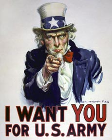
Poster #1 here shows without doubt the most famous American piece of propaganda, and indeed one of the country's most famous fictive characters. The Uncle Sam character was already decades old by the time the US entered into World War I. This, his most famous posture, was first printed in 1916.
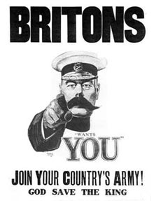
The inspiration was taken from poster #2, a British poster printed in 1914, showing Secretary of State for War Lord Horatio Kitchener. Kitchener died two years later when the cruiser he was traveling with struck a sea mine and sank off the Orkney islands.
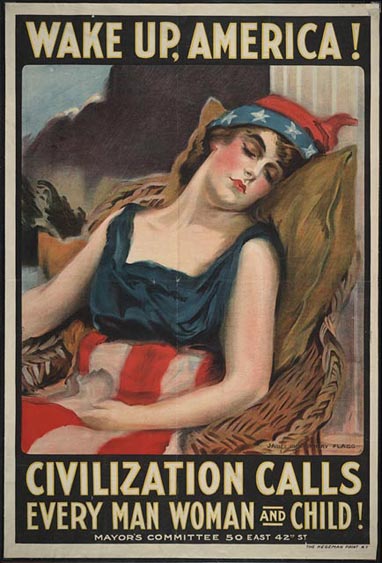
3. Along with Uncle Sam, the United States have traditionally been embodied by two female characters, the Lady Liberty (aka. the statue of Liberty), inspired by the ancient Roman goddess Libertas, who also inspired the British character Britannia and the famous Marianne of France.
The other character, which to a large extend has fallen out of use in the last century, is the woman seen here, Columbia. In 1917, however, she was still a well known and popular character. Derived from the name of Christopher Columbus, the name Columbia was for a long time supported as an alternate name for the United States, both prior to its independence, and afterwards.

4. Submarine warfare was a new and terrifying aspect of World War I. The sinking by German U-boats of several US civilian vessels is seen as one of the factors that finally made the United States enter the war. This grim poster juxtaposes a sinking ship with a German U-boat and the personification of German aggression in the war, the German Kaiser (Emperor) Wilhelm II.
This poster shows a quality that is to be found in most American war propaganda poster from both the first and second world wars, the fact that it encourages some sort of action to be taken by average American citizens to help in the war effort. In this case, it is conservation of wheat, to be consumed instead by soldiers on the front.
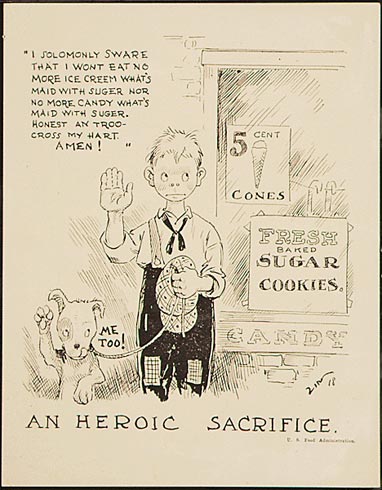
5. The positive contributions each American could make extended to just about every area of consumption. This, one of the cuter posters in this post, is apparently aimed at children, but is extended by its humour to apply to anyone who consumes sugar.

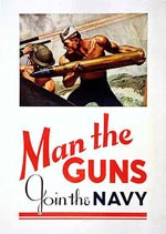
6. A poster that would most definitely not be approved nowadays! In 2008, this poster is so politically incorrect as to be plain funny. The US navy did eventually start accepting women for enlisted service during the war, though they were primarily allocated administrative or other non-combatant positions.
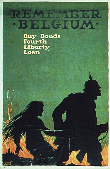
7. Very similar to poster #4, this one shows an unmistakably German soldier leading a captured girl away, with Belgium burning in the background. When selecting these posters, there were some I chose to leave out because they are just too grim, and I'd say this is a borderline case, with all its gruesome implications and harsh aesthetics.
New Deal
After years of extreme stock speculations on the back of massive industrial and agricultural overproduction, the United States plunged into the Great Depression, starting on "Black Tuesday", October 29th, 1929. After winning the presidential election of 1933, Franklin D. Roosevelt launched his "New Deal" program, aimed at helping the country reform and recover from the depression.
While the importance of the New Deal in the recovery that occurred is still being debated, there is no doubt that it did aid in the creation of a lot of fresh visual arts. Thousands of artists and photographers (such as the famous Dorothea Lange) were employed by the various agencies set up as part of the New Deal, resulting amongst other things in some outstanding posters.
One peculiar quality in many of these posters is their similarity to contemporary Soviet posters. While the two states perceived themselves as being worlds apart in their ideological outlook, many of their main goals were basically the same, increased production, efficiency and welfare for their citizens.
The posters presented in this category were all printed between 1936 and 1940.
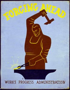
8 & 9. The stylized look of the man in poster #8 and its theme is quite obviously similar to Soviet posters of the age. Big, sharp edged men battering away on a piece of metal are a well known element found in Soviet posters.
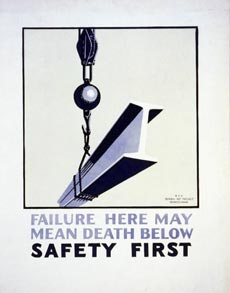
Likewise, the safety advice found in poster #9 is of a kind that could also be found in a great number of contemporary Soviet posters. The simple layout and restrained use of colour in the latter poster gives a subtle beauty that one wouldn't immediately associate with something as crude as a steel girder.
10 & 11. While the highly stylized look of the worker in poster #10 is striking, what I found particularly interesting in this poster is the lettering used. It bears an uncanny resemblance to the lettering used in German propaganda posters printed in the years leading up to, and during World War II, in other words, around the time of the printing of this poster (1936).
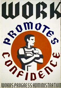
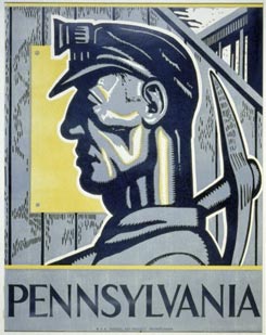
Seeing as poster #11 doesn't seem to contain any obvious message whatsoever, it doesn't seem to be deserving of a propaganda label. It simply shows a Pennsylvanian coal miner in a thoroughly industrial looking poster, and it's a cool look at that, even if its a stark look.
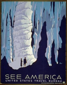
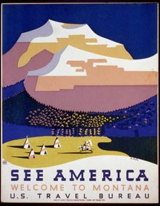

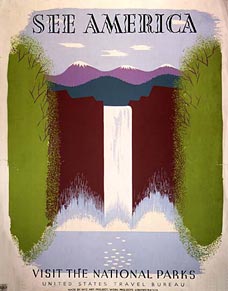
12, 13, 14 & 15. Some of the finest posters I've looked at during the creation of this post, these are true beauties. Despite being printed in a troubled time known (at least to posterity) as the Great Depression, these posters feature a bright, happy mood, showing the various natural wonders of the United States. They all exhibit a rather refined use of colour and type, while the first three all feature tiny human figures among grand natural views.
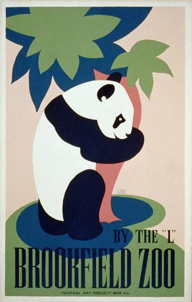
16. The first thought that sprung to mind when I saw this poster was "a tree-hugging hippie panda!". By their look and apparently calm demeanor, panda bears are perceived as some of the most innocent and peaceful mammals alive. When you have a panda bear hugging a tree, its borderline ridiculous in its cutesy look. Despite being almost to cute to bear ("ha ha"), it really is an excellent poster, characterised by gentle curves and a restrained colour scheme.
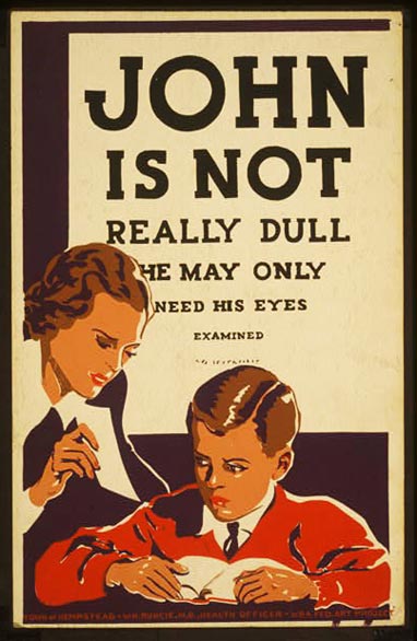
17. This poster, printed between 1936 and 1937, resembles the posters seen during World War II rather than others found during the New Deal era. It's a rather simple poster with a simple message. While It may seem an obvious idea, I like how the designer has made the typesize gradually decrease in the style of a Snellen chart.
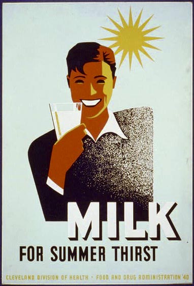
18. Sure, why not? If you can get such great white teeth simply by drinking milk, why wouldn't you want to? A fun, peppy poster. Change the text and put a toothbrush in the man's hand instead, and you'd have yourself an excellent dental advert.
World War II
As with World War I, the US population was far from unanimous in their will to get involved in what was seen as a mainly European problem. And just like during World War I, the USA confined their war effort to actively supplying the allies with hardware and various consumables for the first years of the war.
With the Japanese attack on Pearl Harbor on the 7th of December, 1941, the United States entered fully into the war both in the European and Pacific theaters.
With a war on two fronts against two strong adversaries, the country had to mobilize all its production capacity for the war effort, and a great number of posters were produced to enlighten the population on all the little things they could do to help out.
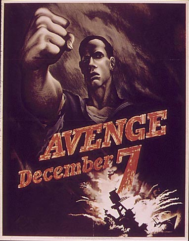
19. The grim look, the destruction and the focus on vengeance gives this a striking resemblance with the Soviet Poster "No escape from the people’s revenge!", featured in my previous blog post about Soviet propaganda. Apart from this particular poster, the anger seen in this poster seems to be lacking in most other US wartime posters, focusing instead on the positive contributions people can make for the war effort.
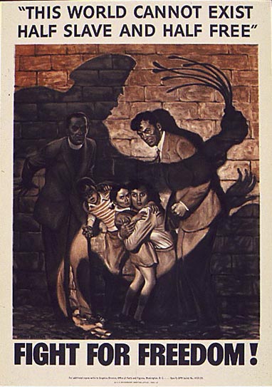
20. Even before its independence, the United States has prided itself in its liberties. This poster quotes Abraham Lincoln's "Divided house" speech of 1858 (albeit slightly modified), warning against the dangers of the country being divided over the issue of slavery and predicting that the United States would either fully embrace slavery or fully abolish it.
The poster takes this message a step beyond, referring not only to the United States, but the world as a whole, predicting that in the long run, there can only be one or the other, the two cannot co-exist. It's obvious which side the poster wants Americans to take if they wish their own liberties to be enjoyed by the rest of the world, and indeed by themselves in the long run.
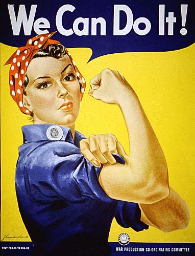
21. One of the most famous American posters from the war, it shows the iconic "Rosie the Riveter" as an encouragement to the millions of American women who were needed to fill the traditionally male jobs now becoming vacant with the men at war.
The two world wars, especially the second, were important in showing the feasibility of women holding traditionally male jobs. While after both wars, the women employed during the war were "sent back to the kitchen", in the long term, their crucial contribution to wartime production helped open up a vast amount of new career opportunities.
Nowadays, this poster is still seen as a symbol of feminism and female empowerment.
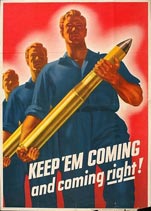
22, 23 & 24. A large number of posters of this kind were printed during the war, with big, strong, handsome men carrying some sort of ordnance, in most cases fairly huge artillery shells.
Some of these, such as poster #22, were involuntarily funny, with their big phallic objects and the words "Keep 'em coming" they have attracted their fair share of parodies in later years.
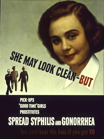
25. Another poster I doubt would make it into printing nowadays. Implying that women bear the sole responsibility for the spread of venereal diseases would cause a massive uproar.
Personally, I have no problems admitting that I think posters like these are funny, exactly because their content is so politically incorrect from today's point of view, and in earnest, I think most people would agree, even if they may not say it out loud.

26. While there was certainly some element of truth to this claim, it's stretching the correlation between driving alone and Axis victory pretty far. On the other hand, propaganda in general isn't exactly known for presenting the facts in a neutral and precise manner.
I'd love to see this poster re-introduced exactly as it is, as part of the fight against global warming. Sure, people wouldn't take the upfront message seriously, but I'm convinced the involuntary humour of the poster would help it make an impact.
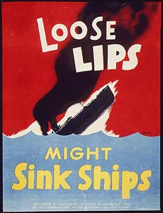

27 & 28. Poster #27 is another famous poster, containing a message that seems to be present in posters in all countries participating in World War II. With its bright, strong colours and effective layout, I'd say this is my favorite US "loose lips" poster.
Poster #28 created quite a stir among women who had taken up work in the factories during the war; the fact that it was a woman being portrayed as the problem was not well received. It is a very powerful poster indeed, using a photo of a real life woman instead of a caricatured drawing really adds gravity to the poster. I would hate to have my face featured on such a poster in wartime though.
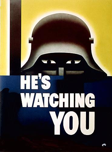
29. Originally created with the same message in mind as the two previous posters, this terribly striking poster was less successful in conveying its actual message. Factory workers interpreted the peeking man to be the "boss", watching and making sure they did their work. Others understandably confused the characteristic shape of a German helmet with the highly symbolic Liberty Bell.
It has been suggested that the look of the German soldier in this poster influenced the look of Darth Vader in the later Star Wars movies.

30. While the look of Hitler in US propaganda was decidedly caricatured and evil looking, the corresponding embodiment of the Japanese was completely ridiculous. This poster is very mild in that regard, as the war progressed, their teeth and fingers got longer and more pointed, their faces more grotesque and their whole demeanour more evil and inhuman.
There was undoubtedly a lot of racist sentiment to be found in the anti-Japanese propaganda that was not present in corresponding anti-German propaganda.

31. Uncle Sam returned in force with World War II, here he's seen directing US forces and demanding the general population purchase war bonds to support the war effort. While there has always been a certain comical quality to the Uncle Sam character, as is to be expected from such a caricature, this poster is dead serious and designed to be as grandiose as possible.
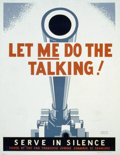
32. Even though I consider myself a very peaceful person, I can't help being impressed by this poster, it's damned tough! The dramatic perspective, making the barrel grow huge from its base is essential in adding punch to this poster.
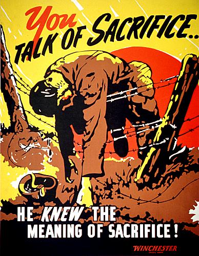
33. This well known poster carries the look of a classic American comic. There were many posters printed to encourage common civilian people sacrificing a little of their money and comfort to aid in the war effort. This is a continuation of the same theme, reminding people how small their own sacrifices were in comparison to that of the soldiers fighting abroad, in this case against the Japanese, as suggested by the big red sun behind the dead soldier.
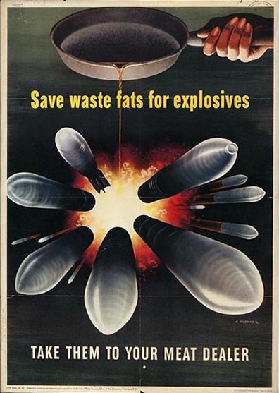
34. One of the things I find enjoyable about looking through these old posters, is to see all the little things they're encouraging. Some ask farmers to make sure to save and hand in metal scrap from broken farm equipment, others encourage car owners to turn in excess tires. I have no idea how great a difference the conservation of excess food fats made to US ordnance production.
Being myself part of today's highly wasteful western consumer society, its hard not to find this somewhat comical, but I needn't do more than talk to my grandparents who experienced the chronic shortage of just about everything during the war to understand what a difference seemingly insignificant stuff like this could make.
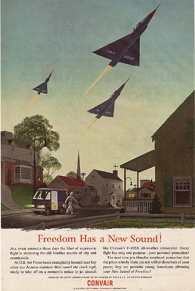
35. 1955: With the end of World War II, the US government stepped down the production of propaganda posters. Propaganda directed towards the new enemy, the Soviet Union, seems to have shifted more towards television, and away from printed posters. At least, I haven't really been able to find any "official" anti-communist posters from the period.
This poster was not created by the US government, but rather by aircraft manufacturer Convair to remind the US population that the noise created by their new F-102 fighters was necessary in maintaining the freedom of the country. It's a very idyllic scene, with a milkman delivering his goods in small-town America at dawn, the fighters actually look like a natural part of the scene.
In reality however, three jets at full afterburners blasting away just above the rooftops would no doubt wake up the entire neighborhood, break a few window panes and damage the hearing of the poor milk man, at least temporarily.
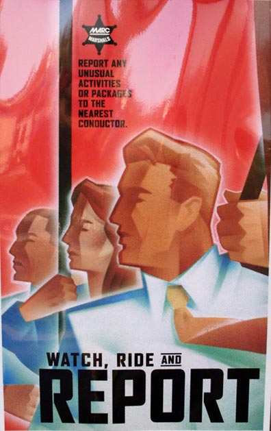
36. 2005: Initially thought to be a hoax, this poster was seen for a while aboard trains in the Washington DC area during 2005. Despite the very obvious references to Soviet propaganda aesthetics, it did in fact turn out to be an official poster. With a "Big Brother" message like this, the similarities must have been intentional, I can't imagine why someone would create a poster combining this kind of message and look in full seriousness.
» Propaganda Design & Aesthetics: Soviet Retro PostersSome American propaganda poster resources:
By the People, For the People: Posters from the WPA, 1936-1943 An outstanding resource on state sponsored art from the era of the Great Depression. Run by the Library of Congress, it contains more than 900 gorgeous posters.
The US National Archives: A huge database which is a good resource if you know how to search it.
Warbird Photo Album:A bunch of posters from World War II, many, but not all related to aviation.
American Propaganda World War II: An article on US Propaganda prior to and during World War II.