The Bembo Typeface
Posted Tuesday, 6 March 2007 by Gudmund in
Icon of the week
We're going way back to 1495 for this week's addition to our series of design icons. What will be next, you might ask, the cavepaintings at Lascaux? Despite its mature age, this is nevertheless a design that is not only historically significant, but also one that most of us see in everyday use on a regular basis, although we might not always be aware of it.
The typeface that would later be known as 'Bembo', made its first appearance in the book
De Aetna, published by the Venetian printer
Aldus Manutius in 1495. Venice was at that time among the most important centres for printing and publishing in Europe, and Manutius is considered one of the most important medieval printers and publishers, only rivalled by Gutenberg. The typefaces Manutius used in his books were cut (and probably designed) for him by the punchcutter Francesco Griffo.
 A type sample from Manutius' edition of De Aetna, 1495. Those of you with an unhealty obsession with punctuation will also want to know that this sample shows the first ever printed semi-colons.
By this time Italian publishers had moved away from the heavy blackletter typefaces used elsewhere in Europe. Instead of attempting to imitate handwriting and calligraphy, they created type inspired by the perfectly proportioned lettering of classical Roman inscriptions, as seen on
Trajan's column in Rome. The Bembo typeface retains a couple of calligraphic features, as can be seen in this example:
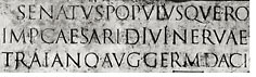
 Inscriptions on Trajan's column in Rome
Nicolas Jenson, another printer based in Venice, actually introduced a typeface very similar to 'Bembo' a few years earlier. Some consider his typeface 'the original and best', but it is Aldus Manutius that has been best remembered by posterity. Manutius' type also became the inspiration for french type founder Claude Garamond, who contributed to the widespread use of the style of serif typefaces now often called 'Old Style'. These typefaces created a standard for typography that still stands virtually unchallenged, at least in the world of book publishing.
With the ongoing technological advancements in the areas of printing and publishing, not to mention the rapidly changing trends and conventions in visual culture, the longevity of this typeface is nothing short of remarkable. The Bembo typeface is a design that can still be appreciated on its own merits, even without seing it in a historical context. Gutenberg's blackletter typefaces on the other hand, have fallen out of favour entirely, appearing distinctly medieval and virtually unreadable by today's conventions:

The typeface we know as 'Bembo' today, is a revival of the printed original, created by the
Monotype Corporation under
Stanley Morison's direction, in 1929. A digitised version appeared in the 1980s. You might wonder where the name Bembo comes from; the typeface is not, as is often the convention, named after the publisher or original type designer, but after the author of the publication where it first appeared, the cardinal and scolar
Pietro Bembo.
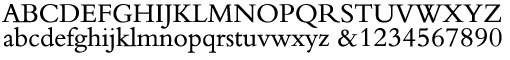 Monotype Bembo digital type
 Apparently the elegant and balanced feel of Bembo does not quite represent the demeanor of its creator: it is believed that Francesco Griffo was hanged in 1518 for beating his son-in-law to death with an iron bar during a fight.
Related posts:
» Icon of the Week: Minard's Map» Icon of the Week: The Routemaster Bus» Icon of the Week: The Leica Model I