7 Common Design Mistakes That Clients Love (and how to fight back)

Posted Thursday, 30 July 2009 by Peter Alexander in Design, Entertainment, Inspiration
From flash intros, to logo theft, to information overload, clients often ask a design team to do a lot of stuff that’s just plain wrong. Here are 7 of the most common mistakes clients might ask you to make -- and how to talk some sense into them.

1. Scrimping on photography

The problem: For some reason, lots of clients will happily pay for hours and hours of a designer's time, printing costs, etc., etc., but they'll freak out when it comes time to pay for photography. Either they'll want to avoid using it altogether, or they'll send you a bunch of lame images from their marketing department. Of course, not every project needs photos. But when you know they would make a big difference to the quality and effectiveness of the design, it's frustrating to be told no.

bad-stock-photography

(Image courtesy of Crestock's Daily Worst submitted images)

How to fight back: Tug at their heartstrings so they'll open the purse strings.
Good photography has the ability to provoke an emotional reaction. Use that to your advantage. Whenever possible, avoid using weak place-holder images in your mock-ups. Before you present any mock, even an early iteration, take some time to find great imagery that helps communicate their brand and your design. And don't be afraid to draw on some expert advice on the subject. When David Ogilvy wrote his classic book Ogilvy On Advertising, one of the key lessons was the importance of a good image for memorable design. And, as the good folks over at FutureNow write, "Tests Indicate Ogilvy's Old-School Layout Still a Winner".


2. Wanting a Flash intro, despite it being 2009

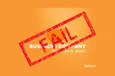
The problem: Seriously people, do we really still have to talk about these? They're just a bad idea. People are impatient, and if they're coming to your client's website, it's because they want something. What they don't want is to see a bunch of vector graphics swooshing around pointlessly.
flash-intro

How to fight back: Drop some stats on them.
The killer number? Fully 25% of site visitors will immediately leave when they see a Flash intro. And that's even if there's a "skip intro" button. If losing a quarter of their potential traffic isn't enough to convince a client to ditch it, then you can pick up some more ammunition from "How to Convince a Client They Don't Need a Splash Page", at the great SEO blog SEOmoz.


3. Too much information

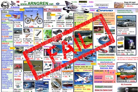
The problem: The average client seems to have never heard the old adage: less is more. No matter what you're designing, they'll want to add more copy, links, calls-to-action, logos, headers, footers, global nav elements and 1-800 numbers. Part of the problem is that they think that if it's there, their customers will read it. And sometimes part of the problem is that they're balancing the needs of fifteen different divisions within their company, who all want some of that prime screen real-estate on whatever you're designing.
messy-website

How to fight back: Ask them what they want the design to accomplish, not what it should contain. No matter what you're designing, it should have a purpose. Whether it's a poster, product packaging or a corporate homepage, the design should serve to accomplish something for the person who will ultimately be viewing it. Once you're discussing what a viewer needs from the design (rather than what the company wants it to contain) you're on the right track to reducing the amount of information to only that which is necessary.

The "Long Neck Theory" by Gerry McGovern states that every website has a very short list of "killer tasks" that visitors to the site want to accomplish. His testing indicates that just 5% of content, which serve those killer tasks, is used by at least 25% of visitors to a site. And past that key 5%, the vast majority of the rest of the content is only useful to a tiny percentage of people. Which means that not every little bit of content on a site needs prominent placement.

If you're designing for the web, hopefully you'll have an interaction/information architect on your team to help fight this battle. But if not, a little knowledge of some basic usability guidelines can go a long way. If you want to read a very smart and easy to read introduction to the subject, check out the book "Don't Make Me Think" by Steve Krug.


4. Using white text on a black background (for the web)

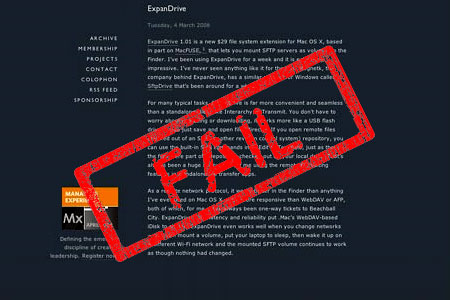
The problem: Okay, admittedly this is a controversial one. There are many designers who love this aesthetically, and feel that it provides the right amount of contrast to make it very readable. And if you're designing for print, it can be effective, especially if it's used sparingly. However, if you're designing for the web, and a client asks you to do it, just say no. And the reason has nothing to do with the way it looks. There's a significant percentage of people who find it very uncomfortable viewing a page with that color scheme. And they will leave the page, never to return. There isn't much agreement on how high that percentage is...but if you're losing any traffic just because of the way text displays, that's a problem.
white-on-black-design

How to fight back: Bust out the usability hammer.
Yes, many designers feel that sticking too close to usability guidelines can lead to stale, predictable design. But those same guidelines can be a good weapon when you want to talk a client out of something. Generally, usability guidelines indicate that to get the most readable level of contrast, you're best off going with #333333 or #444444 on a white background, as design researcher Todd Warfel explains in his post "Color Theory in the Digital World".

You may not necessarily agree with that idea (and you can judge by yourself, cause what you're reading right now is #333333 on white), but you can still use it to help convince a client to ditch the white on black.


5. Wanting the logo bigger

The problem: Okay, this is a bit of a cliché joke among designers, but it's cliché for a reason. Almost anyone working directly with clients has had to deal with this design mistake at some point in their career. A big part of the problem? When they look at a design mock-up, many clients have trouble imagining themselves as a customer. They focus on what's important to them – the logo and other branding elements. And so it's only natural they want them to be receive more emphasis, at the expense of all the other really important stuff their customers want, and that you've spent hours and hours putting together in an elegant and effective design.

logo-bigger

How to fight back: Nike to the rescue.
There are lots of arguments you can make about why the different elements of your design are the size they are, and are placed where they are. And hopefully you'll be able to speak to your design in a way that's so convincing, the client immediately agrees that their idea to make the logo bigger isn't a great one. You could even mention usability guru Jakob Nielsen's assertion that: "The most critical page elements should be visible above the fold" (Guideline #66 on his list of "113 Design Guidelines for Homepage Usability") and therefore an excessively large logo is taking very valuable real estate away from things that site visitors are actually looking for.

But, if all that doesn't work, then talk to your client about the Nike swoosh. Specifically, how it's one of the best, most recognizable, most remembered logos in history. Then show that client any Nike ad, or bring up Nike.com. And make a show of pointing out that little, tiny, logo waaaay off in the corner of the page. It's not scientific, but it is a good anecdotal case study that might help convince them that you're not crazy for keeping their logo nice and tidy and small medium-sized.


6. Ripping off someone else's logo

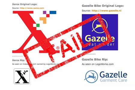
The problem: You've been asked to design a logo. Great, you get to test your creativity as you struggle to come up with something cool within the extreme restraints of logo design. But there's one catch – the client shows you another logo (maybe it's for a competitor, maybe it's just for their favorite brand of baby food) and says "make it look kinda like this."
logo-ripoff

How to fight back: Play to their ego
On a purely ethical level, ripping off a logo is not cool. But good luck having a civil conversation with a client, where you convince him or her to re-assess their ethical code. So the best way to fight back here is to convince them that their brand's identity needs to be unique because, after all, their company is better than the competition, or at least should aim to be.

If they skew their own logo and branding too close to that of another company, they risk consumer confusion. And while a bit of consumer confusion may actually be appealing to a client who's own company is the new kid on the block, if they ever hope to be top dog, they'll benefit greatly from their own strong brand identity. And that all starts with a unique logo.

More logo-ripping at FloatingBanana and information on How NOT to Design a Logo over at Webdesign Depot ;-)


7. Wanting a terrible font

The problem: Fonts matter. As a designer, you know that better than anyone. But for people who don't really spend much time thinking about them, fonts can be mysterious and confusing. And that can lead to truly terrible design direction from clients who know just enough about fonts to care which one you choose, but not enough to actually know what works.
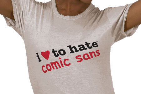
comic-sans

How to fight back: Tap into the research
Because typography's been around for so damn long, a LOT of research has gone into the use and efficacy of fonts. Of course, in the age of digital, some of that work is obsolete. But font usage continues to inspire massive amounts of studies and research. So much that you can look online and quickly find a half dozen references to why exactly it's a terrible idea to use, say, Comic Sans.

A good starting point to find some of these online resources is the "Fonts & Typography resource page" here on the Crestock blog, or get your own "Love to Hate Comic Sans" merchs here.

Ever wiggled your way out of a bad client request? Share the secret of how you did it!

Other great posts you'll enjoy:

» Top 50 Blog Posts on Usability, Web Design Resources & Cheat Sheets of 2008
» 10 Famous Works of Art (with client feedback)
» Another 23 Signs You're Becoming a Design Geek
» Top ten gadgets every designer SHOULD live without
» 10 Stock Photos That Just WON’T Sell!
 
Weekly Free Stock Photo The Weekly Free Stock Image
We are giving away a free, high quality photo every week! Get Your Image

Comments:

White on black
By jfs on Thursday, 30 July 2009 12:26 PM
White text on black also gets far more difficult to read as the screen gets smaller. With the growing use of smartphones, this is becoming a much bigger issue.
By MikLav on Thursday, 30 July 2009 7:17 PM
I hate Comic Sans too ! :)
holy cow!
By c-g on Thursday, 30 July 2009 7:39 PM
You're right! as an entrepreneur gathering ideas for my website this is a great post. Most of your points sound as common sense which some times we just don't have.

But what gets my attention is point #1 Scrimping on photography:

As a designer's client, I have to admit it was hard to see the value of a photograph, mostly because today even cheerios box seems to include a hidden camera so you just need to point and click, so, "why does a designer/photographer should double or triple the cost of a website design for a bunch of pictures?"

For this (and other) point(s), I find confidence and peace of mind when my designer explained me the intricate theory behind every decision we have to take.

At the end, designers will feel free to ... design. And customers will appreciate and get the most of value of the final work.
Flash is relative
By Juanita on Friday, 31 July 2009 4:07 AM
This guy is amazing. http://www.luissantijr.com/#work I think that his intro is functional as well as very clever. Also it is to showcase some of his design talents. I do agree that just a regular flash intro for the sake of having something move accross your screen is pointless, annoying, and does not work well in all browsers. So you should be aware of the reason for using it as well as the entertainment vs. spam factor.
Absolutely Best Blog
By ShhDiAnne on Saturday, 1 August 2009 8:02 PM
This is the best blog I've read on web design in a long time, great use of images, cutting, funny, brief and for once, links to supporting articles. Where've you been all my life?
Speaking of mistakes
By Kenneth on Sunday, 2 August 2009 7:44 AM
You forgot to put a background color in your theme.
Thank you for the info!
By Monterey Web Design on Tuesday, 4 August 2009 9:08 AM
I just registered my web design business in Monterey California. Thank you for this!
Photography can make or break a website
By Laura on Tuesday, 4 August 2009 11:47 AM
I have seen so many brilliant website which are ruined by photography!
But Nike is a big brand!?!
By Dalington on Tuesday, 4 August 2009 3:11 PM
I've used the Nike example before, but they turned around and said that Nike was a big brand and anyone could recognize them from a mile away! They said that people had no clue who they were and wanted the logo BIGGER! Nothing I said could change their minds :(

I eventually gave in, not a portfolio piece to say the least.

Great blog by the way, good reading, keep up the good work.
By Pace on Tuesday, 4 August 2009 7:47 PM
Here's another anti-comic-sans site that I love: http://bancomicsans.com/
On Item No. 4: I disagree scientifically, but agree aesthetically
By Joshua Mormann on Wednesday, 5 August 2009 2:30 PM
First off, I use reverse the type in all my codeing apps [that will allow me to do so so]. Second, cite daringfireball.com as an extremely successful example of reverse type on the web.

Saying that it can be used sparingly in print but should not be used on the web, is a complete flip-flop of what has been said by "experts" for the past 15 years.

Let's not forget that computer screens are big, bright lights that radiate toward one's face (all day in the modern world). Reversing your type can limit eye strain, by cutting back a significant amount of light. I don't think it's used enough actually. Computer screens all used to be reverse type back in the 70s and 80s, maybe I'm just old fashioned.

Aesthetically when it comes to web design, I agree with you. I PREFER to have white backgrounds for a majority of text for the "printed page" look. But don't ask me to read one of the sites I've designed for any extended length of time, without paying me for the damage to my retinas (I know, I'm hypocritical). I like the look, but I hate the eye strain. Most studies a few years ago, were pointing to the opposite for web vs print.

I love the article though, All your other points I agree with wholeheartedly. So, Don't hate me, I'm just voicing my op on No. 4.
Absolutely right!
By BEEANDGLOW on Saturday, 8 August 2009 1:49 PM
But in more cases - only client has right and its very difficult to do some compromise.
Horror Client
By Nick Jag on Monday, 10 August 2009 8:44 PM
My best freelance story so far (completely true):

Client: Okay, I have the page typed up for you.
Me: Great, you can email it to me at...
Client: How do I do that?
Me: Well first, you saved the file right?
Client: ...
Me: ...
Client: It's typed up, how do I have save it?
Me: What program did you create it with?
Client: A Typewriter
Me: ...
Yeah, you're completely right
By Lucas Tadeu on Friday, 14 August 2009 1:49 AM
Gotta, agree with you, that's happened a lot with me.
@Nick wow, can't believe that =O
So true!
By Pamela on Monday, 24 August 2009 12:49 AM
I can definitely relate. Especially #1 - skimping on photography. That happens all the time. It's good to get agreement upfront on the photography budget to avoid this type of situation.
By Velocity Kendall on Monday, 24 August 2009 1:02 AM
Great post.

"Let's not forget that computer screens are big, bright lights that radiate toward one's face (all day in the modern world). Reversing your type can limit eye strain, by cutting back a significant amount of light."

Not to add fuel to this one but is eyestrain actually related to bright light? I do like light copy on dark ground but several of my friends say it hurts their eyes. The root of the problem for clients, designers and users is the danger of assuming everyone thinks like you.
By Mr. Harrison on Monday, 24 August 2009 1:08 AM
Also: tabbed navigation, no matter what.
By Joe Cascio on Monday, 24 August 2009 3:21 AM
Good post, but you omitted what is for me the #1 Don't-Ever-Fucking-Do-This commandment for web sites: "NEVER auto-play music, or any other audio, for that matter".
Photography
By Luke on Monday, 24 August 2009 4:12 AM
If the client ums and ars about buying stock photography, i tell them i have a large database from previous work that i will look at for suitable photographs, i then just buy the required photographs (within reason) for the artwork and just hide the costs in design hours and other bits and pieces.

It makes the design better, which means the client IS happier and you can then happily use the artwork in your portfolio.
By maurijn on Monday, 24 August 2009 7:58 AM
Like the post, and by the way I agree with Joe about the music.

I instantly checked nike.com to look a the logo: got all black pages with white text. Maybe not the best example in that respect ;)

Good points, though
Story added
By designmoo.com on Monday, 24 August 2009 7:59 AM
Your story was featured in designmoo.com! Here is the link to vote it up and promote it: http://designmoo.com/node/2086
By Placehold on Monday, 24 August 2009 8:32 AM
Fantastic,

Thank you for this thread lol

I had a customer last week who hit on 4 of these :)

Regards


Craig
Idea
By Moinid on Monday, 24 August 2009 8:35 AM
Often the client kills interesting ideas.
Too much information
By Mark van 't Zet on Monday, 24 August 2009 8:50 AM
About the third point ("Too much information"): it is also very dangerous if the designer manages to stuff a lot of information in a design in a clever and unobtrusive way.

This usually means that texts are tightly spaced, which leaves no room for internationalization (some translations take up to 3x as much space as its English counterpart) or customization (e.g. changes in phrasing after the design phase has completed, or long names of logged in users).

This is something I run into a lot when working with designers and clients.
photos
By Dave Sparks on Monday, 24 August 2009 9:24 AM
I agree with the photography point, there's nothing worse than a good design being spoilt by bad photography. E-commerce sites often go this way once you leave the client to add their own products.
White on black
By xfool92 on Monday, 24 August 2009 10:43 AM
If you display a lot of video on a site, or many photos and video, a balck background is best. It allows the video to look far clearer and easier to view.
A white background is too hard on the eyes if you expect people to do a lot of reading on your site. I feel half blinded just reading your article and the comments.
Jakob Nielsen's usability page sucks
By Doc on Monday, 24 August 2009 10:59 AM
Jakob Nielsen's page 'Guideline #66 on his list of "113 Design Guidelines for Homepage Usability" (http://www.useit.com/homepageusability/guidelines.html)' really sucks.
1. How can you read that page without seriously damaging your eyes? And 2. how can you avoid getting a real bad headache for having to concentrate so hard?
Imprinting the logo
By R.W. Jackson on Monday, 24 August 2009 2:27 PM
Great story. My favorite is when the client decides that you need to imprint their logo or buzzphrase into the text of the site a set # of times. It's like a bad combination of horrid SEO practice with the worst of commercial radio.

Thanks again for the great post.
Measurments can be tricky
By suzeric on Monday, 24 August 2009 4:45 PM
years ago - a client complaint that the dimensions of the page elements were not according to the specs. Turned out she measured by holding a plastic ruler against the screen.
How to manage clients who don't even understand the basics and consequently do not trust the experts?
By swapnet on Monday, 24 August 2009 5:21 PM
they keep making me make the same mistake again and again.
By qbma on Monday, 24 August 2009 6:57 PM
Comic Sans... I just laughed at this one. That's exactly what a client asked when my designer worked on a book cover. The client wouldn't listen. We wound up with comic sans - to keep the client happy. Oh, well...
By Ikaro on Tuesday, 25 August 2009 3:13 AM
Great post :)

The Flash intro is a plague.

Dan
Background and Flash
By Bec Thomas on Tuesday, 25 August 2009 7:04 AM
It's amazing how many people don't seem to get that Flash is an ultimate website evil, not to mention search engines ignore it. Also people that like red/pink font or red/pink backgrounds really just disserve to go out of business!
Comic Sans MS
By Quakeulf on Tuesday, 25 August 2009 8:21 PM
Nice article, and I must say it helped me a lot on number 3 with the "too much shit going on".

But a guilty pleasure of mine is to use Comic Sans MS if my client wants it. I can practically hear the veins popping from across the internet. :3
A love/hate relationship with Flash.
By Webme1 on Wednesday, 26 August 2009 2:21 AM
Some interesting points in this article.

I like flash presentations, but only if they are ready within a few seconds. I do not hang around for a fancy presentation to load, when the information I want is hidden behind it.

Quite often, when I consider following someone on Twitter, I visit their site. If flash gets in the way of the content, I do not wait to view their site and do not follow them. Like most people, I want my information fast and easy and then move on.

I think flash presentations can be effective, but should be optional. Unless they are very fast to load and give the viewer an easy out, they should be avoided.

Occasionally you will see a web site that gives you a choice before you are hit with the flash. Well done them! Sometimes I will view the site and then return to view the flash. My choice! If I am not given the choice, chances are I am clicking on the next web site instead of waiting for a forced flash presentation to load or finish.

I agree with most of points raised . This article makes for interesting reading. I look forward to reading more from Peter Alexander.

I also liked the comment from Nick Jag, 10 August 2009 8:44 PM. Horror Client. I could not help but smile.
Well said
By danienel on Wednesday, 26 August 2009 6:40 AM
Great blog, short enough to keep me interested, long enough to keep me informed. Concise, to the point, devoid of pointless opinion and I could focus on it while my kids are watching Happy Feet, top volume.
And drop down menus
By Deborah on Wednesday, 26 August 2009 9:11 PM
I keep getting requests for long, convoluted drop down menus.
Flash Intro Required? The Horror!
By Rebecca on Wednesday, 2 September 2009 1:25 AM
"It will add interactiveness to the website!", she said smiling while I died a little on the inside. With the best poker face, trying to be devoid of emotions about the subject, I go into great detail to explain why a website is "Interactive by nature".

Not only she wanted the Flash Intro from Hell, but also a Flash header that would loop some images and text typing effects galore... The menu should also be animated as well, with sparkles, fades and whatnots...

"Just like this site", she said while typing on my laptop the address to another website she wanted us to "get inspiration" from. We wait for it to load, then wait for the animation to go away and wait again for the site to load again.

"OK, that was pretty", I said, "How many sales are you willing to loose to prettiness?". "Wh... what?" she reacted confused.

I take my keyboard back and start typing another site that almost has the same layout but a different approach. In mere seconds we are at the page fully loaded.

"This, like many other stores, will make you sell more, simply because time is limited to your customers. So if you take away their time to show them a pretty animation, you make them loose time to browse your store and potentially lose sales."

You could see how hard she fought with the ideas that I presented to her, you could see how difficult it was to accept it, to relinquish control, to be humble about this. She wanted the animations yet she wanted more sales too.

"I'll tell you what", I interrupted her train of thoughts, "How about we create a widget instead? One that would let your customers showcase their wishlists and link them back to your site?".

She got it, and now the site is Flash Intro Free!
By Kate on Wednesday, 2 September 2009 4:52 PM
Thank you thank you for article, Peter Alexander!
You made my day :)
But dear designers, dont be angry on customers. "Bigger logo" and "this funny font" it's their creative process. The same like yours, but...lets say... on different level :D
The Web is not Print
By Web Page Mistakes on Sunday, 6 September 2009 8:10 AM
Add to you list: The web is not print. Explaining to a client (or a print oriented graphics designer) that you cannot control a web page like something that was created for print is very hard. They want things pixel perfect, which you can't do without compromising cross-browser compatiblity, usability and accessibility.

Add your comment:

Further comments have been disabled on this post.