The first thing I do when creating a digital composite is organize my thoughts on what the final outcome should be. By this I mean I draw it out. Most importantly, I look over the deadline and break it down like this -
This is very important!Day 1: Pre-visualization and planning
Day 2: Gathering the materials
Day 3: Principle Photography
Day 4: Post Production
Day 5: Post Production
Day 6: Post Production
Day 7: Finalizing, last minute changes and submission
The programs I used for this was Adobe Photoshop CS3 (mac) w/ Primatte plugin using a MacBook Pro. The camera I used for my additional footage was my Nikon D300 and Nikon AF-S 24-85mm lens.
I found it rather fascinating that this file ended up close to 1 gigabyte in size - currently, the biggest Photoshop file I've ever worked with!
Once the concept has been established and finalized, I proceed by gathering materials and commencing with principal photography.

1: With the help of my Wacom 6x11 graphics tablet, here's a rough template of what I worked with. This was just a rough estimation to get the perspectives right. Nothing finalized of course. Strictly pre-visualizing the final outcome.

2: Once everything has been finalized and carefully selected, I proceed in gathering the materials (in this case I needed to do a little running around). Seen here are most of the materials.
I didn't end up using them all but it's good to have the extra materials in case you did need them - that way you don't find yourself driving back to the store.

3: During my trek to search for materials, I found this in a craft store - fake snow!

4: Picked up a few packets; All you need is to add water ... mix it after a minute ...

5: .... instant snow!!!!! It looks mighty close to the real thing too!

6: Out of all the materials I've scouted, these mini toy reindeers were the hardest to find! I had to visit 5 stores to find the right sized reindeer and style suited for the idea. Luckily, these little guys came in a pack of 3 with various styles and poses!

7: Next was the sleigh for Santa. It was $9.99 and it had a penguin stuck on the back (which I had to remove of course). I positioned the items to what I had wanted them to look in the final shot.

8: Another key element to be added later was Santa Jr's hat. You also have to keep in mind lighting the objects correctly as this plays a crucial role in your final composite.

9: The same time I found the reindeers, I also found these wonderful little gift box trinkets - They were only .25 cents each! Adding it to the fake snow was really easy.
Originally I was going to make real gift boxes - but that would have been a lot more time consuming to set up. You must always remember that you have a huge time constraint when it comes to these kind of situations.
The snow looked cool - it really
did look like snow. The only bugger about it was it was really hard to clean up after. It had these tiny salt sized balls that wouldn't wipe off easily. It was all over the floor and using duct tape inverted to the sticky side was the only way to grab all the little bits off the floor - very irritating to clean up after <_>.
Another headache was to mask out the snow from the green screen. The color cast from the green boards spilled on the white snow which caused some headaches for me (Luckily primatte has a spill suppressor option to tone that down). I ended up shooting about 100 different angles of this to get the right shot.

10: Santa Jr.'s Snow boots which were digitally added later (They're actually my snow boots). Bits of the artificial snow was added below to ‘co-exist' the boots with the environment.

11: After the indoor shots were complete, a walk around the ol' neighbourhood was required. There was a house nearby my place that had the perfect roof shingles for me to work with! I particularly chose this because I need to have the roof tiles individually removed.

12: A couple of blocks down the street, This house had the right window pane I was looking for ...

13: ... Walking further down, a neighbor's lawn was added to my composite. Once photography was wrapped up I transferred all the raw images onto my computer and got me some rest for a long journey in front of the computer the next day (yes folks, sleep is
very important in this kind of work, I learned this the hard way in college).

14: Post production & photo-chopping starts - What better way to do it than use the paths tool in Photoshop of course.
For many years I struggled with this tool and I refused to use it. It was only a couple of years ago I forced myself to learn it and get a solid understanding of how this works - and using it for this project, oh boy, you save so much time on cutting things out.
I also
strongly advise to invest in a good tablet when working with digital composites. Your techniques will improve guaranteed. Looking back at using the mouse - what was I thinking!?
One of the biggest hurdles I found when using the tablet was getting used to it. My best suggestion that worked for me is to
hide your mouse!!! After 3 months of hiding mine, I was converted into using my pen tablet - never looked back after that!

15: Masked out the stock image of the man's hair using "color range" and a lot of layer duplication. To do this is pretty tricky but after practice, you'll find this very useful.
Color range is found under "select/color range" tab ... you basically pick out the hair and it creates a selection of it. Fine tune it by adding and subtracting with the slider. Once you have the desired selection, Hit Ctrl-J to duplicate the selected pixels within the selection you just did and Voila, the hair strands are separated.
You have to keep doing this over and over to get it right. This is
not a one step command as it requires a couple of attempts to get the hair separation successfully... so keep trying!

16: Using Crestock's stock image of the demolished building, my task was to re-construct this into a run-down household to where our story comes 'crashing' down. It took a while to build as I had very little samples to work with. This particular stock image was like putting a puzzle together.

17: Using the same pre-visualized sketch I did at the beginning, I drop the opacity to 40-50% so I can see where the objects should be placed.
I then start hacking the images and started adding them in to get the correct angles and perspectives with the use of the "scale/distort" tool.

18: Time to mask out the boots and add to Santa Jr's feet. I had to distort each boot separately to adjust for the position of his legs.

19: Originally I wanted to add the car in looking over what other things I needed to do, I had to ditch it. I had less than a week to finish this so I had to limit most of the things I did...

20: After everything has been reviewed, I continued to work with the pieces and clean up some of the areas. Here I set up the rooftop to what I wanted it to look like and go with it.
I tend to use a bright solid color for the background layer to help see the objects better. In this comp, I used a magenta color. Using this, I can see any green ‘floating' pixels from any images photographed in front of the green background.
It doesn't have to be this magenta color, but this is one I tend to use on all my composites!

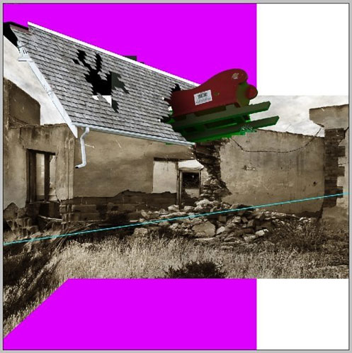
21: Added the building structure from Crestock's stock image to see a quick preview as the comp slowly takes its form. The reindeer outline has been placed and pieces of the roof had been removed to simulate that the poor reindeer crashed right into the structure ...
22: .... more house reconstruction ... boy it was kinda frustrating too cause half the time I didn't know what I was looking at! A lot of trial and error at this point...

23: ... An hour or two later, I managed to get the shape right. The sleigh has been added and cleaned up. The ground cleaned up and added next ...

24: I then added the toy reindeers to get an idea of where to place them. The ground was also added and de-saturated.
One thing I also want to point out that with the theme 'apocalyptic' in mind, i strongly felt that dark tones would have to be used in the composite. De-saturating things down did the trick (Command-U).
I basically used the walls of the demolished house as a starting point to where all the colors had to co-exist with it: a sepia style tone with shades of dark red and green for the Christmas feel.

25: Added the shadows underneath the rooftop to create depth. A fence is added on the side which I later removed.

26: At this point, I started getting frustrated as to where Santa Jr. should be placed.
Originally I had him at the bottom right hand side of the image but knowing that I would have to create something for him to sit on, I had moved him around the place to try to see what would look suitable.
After moving him around, I placed him right below the house but it became hard to see so I had to move him again to a section where he was clearly visible ....

27:
note: No reindeers were harmed during this VFX composite!!!!

28: after deciding where Santa Jr should be located in the pic ..... and I placed a rough version of him on the roof.
I do this a lot when placing objects in the scene. I usually work with the good copy in another file and clean it up before I bring it onto the final canvas. I also planned to add a chimney stack on the side which I later ditched due to time constraints ...
Anyway, so far so good ...I started shading in some areas of the scene (blur and dodge tool) to accentuate the mood of an 'apocalyptic' event. I also planned to add a chimney stack but due to time constraints, I had to park the idea aside.

29: Now to add traces of snow by the rooftop. This was actually fun to put together and didn't take too long to apply. A couple of layering here and there, you got yourself snow on the roof!

30: Time to work on the surroundings. I had stock footage of sky that I photographed this past summer so it came handy.

31: Desaturated the background to match the entire scene without losing the 'apocalyptic' feel ... (Command-U).

32: And now to add some snow on the ground. Adjusted the sky a bit more and added a red glow from inside the house (simulating Rudolph's nose glow from the inside). The windows of the house also had to match the red light...

33: Here's a nifty effect I picked up from working on this project: Using your dodge tool in Photoshop, select a brush with the softest edge and make sure you have highlights selected.
You then paint a circle from the sky you have in the background and make sure you select an area where the white clouds are and - VOILA! You have yourself a simulated sun in the background that mixes nicely with the sky as if it was
behind the sky!
One of the coolest things I learned from making this comp! And it was all by trial and error on my part! One thing I want to advise people is to
never use lens flare filters, it screams out amateur!

34: I used the factory to be added in the background. Once again, using the path tool helped me out a lot on this one!
After a few minutes, I was left with a nice clean mask of the factory but of course I had to mask out the smoke fumes with the help of the color range trick I mentioned above!

35: Placing the factory into the scenes background, I realized I needed to place the sun somewhere behind it. ... that's better!

36: One of the reasons why I admire participating in these competitions is the new skills you learn along the way. One of them was using the Channel Mixer in Photoshop to create a simulated snow surface on the grass!

37: Another good use for the Channel Mixer was on Santa Jr's hair: I was able to blast out the specular highlights to help add age. A little tweak here and there, You got white hair!

38: You see, originally I wanted him to be Santa Claus but with the little time I had left, I had to improvise and work with what I had ... Colorizing his outfit red and adding a few pounds on him did the trick.
Time management is crucial in these kind of projects as deadlines are
deadlines dude. You have to be aware of this otherwise you could be left hanging at the end or finding yourself back to square one running around in circles.
Time to add the finalized Santa Jr. to the composite ....

39: Alright - Santa Jr. has been added the final composite ... and
whoa. Although personally, I would have preferred to leave him this way (LOL!) but of course, I had to shrink him down to what I deemed to be the right size for him ....

40: At this point, all I was left with was fine tuning the image.
Seeing that I had a day left for cleaning up, I added individual roof shingles falling from the house. This took some time but worked out well for the added effect.

41: Added some more tiles on the ground. The .25 cent toy gifts were also added to the snow layer located below and that pretty much wrapped everything up ...
This was it - After two cans of Redbull and a few candy bars on the final day ... I'm near completion!
The final result:
 [View fullsize image]
For the final touch, I adjusted the image's hue and saturation to create a somber, cold mood ... (Command-U). I finished this piece at around 10am on Monday Morning Nov 17 - with pretty much no sleep. I couldn't help but analyze everything I could about the image but was pretty happy with the overall result!
As an overview for those who are interested, I'd like to share the following guidelines and pointers that helped me along the way. As a digital artist, I'd like to offer 12 key pointers that I follow when creating composites:
- CAREFUL PLANNING: Always plan ahead. Don't rush either. Take it one step at a time. If a deadline is given, try and break them down by the day and map out exactly what you're going to do. Most importantly - stick to it.
- READ ALL INSTRUCTIONS/RULES CAREFULLY: This may vary depending on your assignments as some of them may not even have any direct rules. But in cases where a theme is distributed, you'll want to skim through any rules, guidelines or instructions given to you and absorb them.
Sometimes the answers to your tasks are hidden in these words/sentences. (ie. Apocalyptic Christmas = hmmmm, that means dark imagery but mixed with Christmas theme... proceed)
- HAVE MORE THAN 1 CONCEPT: Although you would be more likely to be working on one concept, having another one on the side doesn't hurt.. you know, like a backup!
Coming up with 2-3 different concepts will help in case the first one doesn't work (ie. cannot get materials etc). Sketch em' out on paper if you have to (I do it all the time!)
- SKETCHES: Draw it to visualize what it's gonna look like. You don't have to be top notch artist to do this, just lay it all out before you start cutting and pasting things on the canvas.
This way you have a solid foundation of where you are going to start. Without it, you'll find yourself juggling things around.
- SLEEP IS IMPORTANT: I used to ignore this. But honestly; get plenty of it. I learned this the hard way in college. I recommend giving yourself a breakdown of tasks to do and make sure you complete all the important steps first. You'll often find yourself staring at the screen till the sun rises right before the deadline (which happens to me 95% of the time), just don't do it all throughout the entire week.
- CRITIQUES HELP ALOT: My sister gives me honest and direct criticism towards the images I produce. I also get friends' opinions in hopes to see where I can improve.
I tend not to listen to anyone who just says "looks good", because that's not what I want to hear. I want to know "what can I do to improve it" or "tell me what's wrong with it."
Everyone's opinions are different; you will find that there will be some bits that others offer as advice but you will end up disagreeing with (which is fine) but merely use their feedback as a guideline. In the end, it is your style, your work so you make the final call!
- PATHS: Learn how to use paths in Photoshop - I used to DESPISE this tool because the bezier curves would drive me nuts. With plenty of practice you'll get the hang of it. I never thought I would, but I did and I can't go on without it!
- TABLETS: Graphics tablets are a must in this kind of deal. It took a long time for me get the hang of it but I forced myself into using the tablet by hiding my mouse for a few months - and next thing I realized ... I couldn't work without my graphics tablet!
- STUCK WITH STEPS: Don't know how to perform something in Photoshop? There are thousands of free tutorials out there. Your best friend is Google and Youtube. I found these to to be the key to anything I need. And I would say 90% of the time, you'll find an answer!
- MOVE ON Don't over-analyze parts of your composite. Be aware of the other things you need to finish. If it doesn't work, ditch it and move on. Time is of the essence when it comes to deadlines!
- SAVE DIFFERENT VERSIONS: Oh boy, I can't stress this enough. Save different versions of your file on your desktop because you'll thank yourself for it. If you have saved your file and closed it, You won't be able to retrieve any changes you've made prior to what's already on your screen! Even if you end up with a stack full of different versions of your file that's taking up space, get them on a DVD or transfer them onto an external HD!
- KEEP MOVING FORWARD: In this day and age, you'll almost always find yourself running into intensely gorgeous artwork by designers all over the world. But fear not and never get intimidated by other people's work - keep going and just do your best and finish what you have started.
Everyone's gotta start somewhere, they're just a bit ahead of you that's all. With a little time and effort, you'll get there. I find a lot of people get dismayed when they see how good other people's work looks, but focus and finish it because in the end, you'll have a new piece of artwork to put under your wing. Even if others disapprove, it don't matter - just be proud of what you made.
Now although this doesn't directly correlate with design and graphics, it helped me channel and focus to prepare myself whenever I work on challenges: this scene from Rocky 6 inspired me to keep moving forward as explained by Rocky Balboa to his son.
"It's not about how hard you hit, it's about how hard you can get hit and keep moving forward" - I truly believe in this principle.
Thank you Crestock.com - I find these competitions are a blessing, for they really help challenge us and better our skills as digital artists; not trying to be perfect but striving for perfection is what I really enjoy!
I walked into this final round with no intention of winning but strived for the challenges ahead, being able to finish what I started; and more importantly - keep moving forward ..... and I did! This to me was the real prize.
Thanks for reading my post - Hope you enjoyed it!
Visit Sito's blog here
Related Posts
» Design Tutorial: Creating a Propaganda Poster» Photoshop Tutorial: Gift for Tomorrow» Photoshop Tutorial: Creating the Hippie Tank