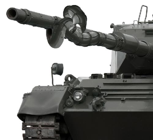
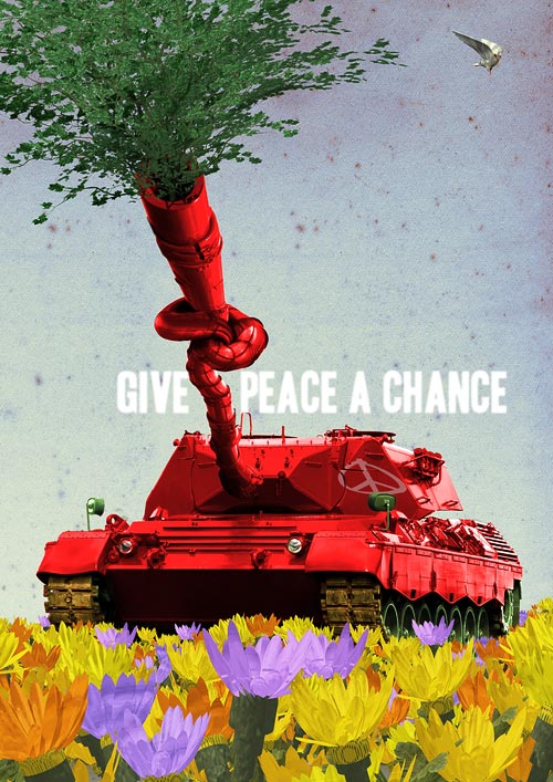
Several Photoshop techniques were used in the creation of his piece, though the most distinct part of the creation included tying a knot on the tank barrel using Transform-Warp and Transform-Rotate.
Another important aspect was the use of advanced shading, such as levels, curves, dodging and burning to make sure the highlights and shadows on the barrel look natural and realistic. But let's find out exactly how Barry went about to secure his 4th place...
Step 1:
Read the contest brief, and ask yourself, "What the hell am I going to do?"
Step 2:
Fill the head with the source images and brief, take a power nap, and get the head around to clicking on some ideas.
Step 3:
Thin out the ideas till the concept is fresh, and (usually) as simple as possible.
Step 4:
Now is the test of whether your technical ability is up to the task of interpreting and communicating your concept. This is the fun bit.
Step 5:
Having decided on a propaganda poster that calls for peace, and having decided to only use the tank image from the source images, take the image and deep etch the tank so that it has no background. There are many ways to do this, path tool, magic wand etc. Find what works for you.
Depending on the image, my preferred method is to fairly loosely select the object with the lasso tool, float it onto its own layer, and then use various brush sizes to paint out the remaining unwanted edge bitson a layer mask. Again, depends on the image.
In this case, since the background was all white, it seemed OK to use the magic wand tool,followed by the layer mask method to clean up the inevitable rough edges. So, the tank now is on its own layer, without any background.
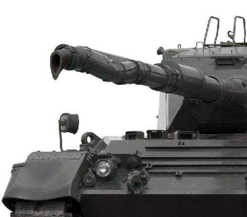
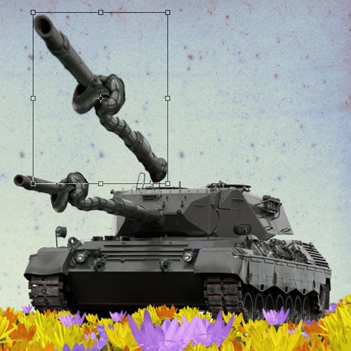
Step 6:
Get a piece of rope and tie a knot, for reference! Then, choose a section of the barrel that looks like it is appropriate, and using the lasso tool to select, float it onto its own layer.

Step 7:
Figure out how it needs to be warped, and use transform>warp todo that. Use transform>rotate to position the new twisted bit.
For illustrations of steps 7-9, see step 9.
Step 8:
Repeat with other sections of the barrel, and position the bits to form the knot. Pay particular attention to the highlight and shadows so that they are as consistent as possible with the logical light source of the whole image.
Step 9:
Use layer masks and paint out the unwanted areas on each layer.
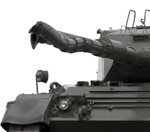
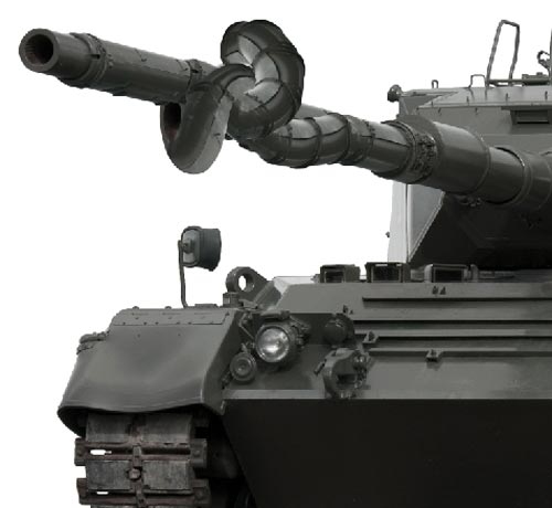
Step 10:
Tweak the highlights and shadows on the individual knotted bits, again to match up with the logical light source of the whole image. There area number of ways to do this; levels, curves, dodging and burning etc.
I tend to duplicate the layer, darken or lighten to the darkest or brightest that I would want the final to be, add a layer mask, fill it with black, and use a white brush with varying degrees of opacity to paint in the shadow or highlight I want. Whatever works for you.
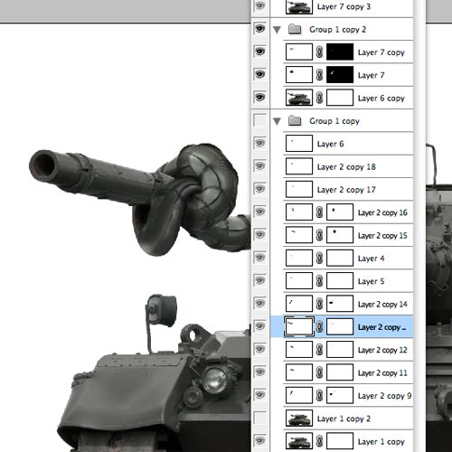
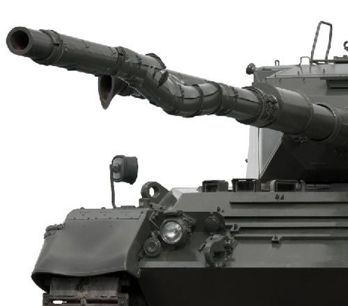
Step 11:
Generally, I like to keep all the steps of layers so that I can always come back to tweak. So, I then group all the layers of my tank,duplicate the layer group, and flatten the duplicate group. I now have a complete tank, still on its own layer, but floating, and I turn off the original tank layer group.
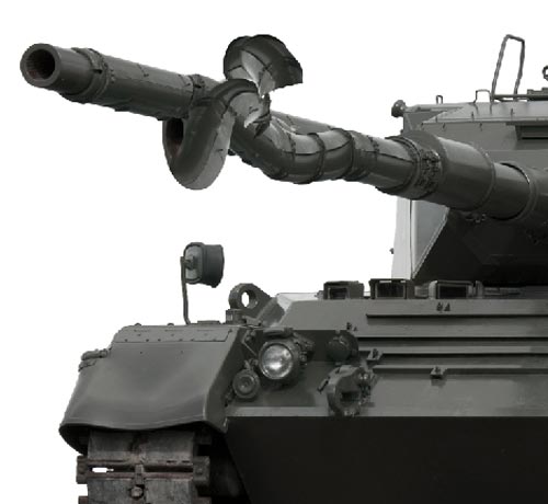
Step 12:
I then decide that the barrel needs to be extended for perspective and graphic layout purposes. Resize it using the transform function, as well as transform>distort to create a sense of perspective, to make the barrel look like it's really protruding.
In this case, the sense of perspective is totally wrong in relation to the focal length used to shoot the original picture, but that somehow adds to the feel of the image. It won't always!
Tank barrel and colours:
1. Position tank with knotted barrel.
2. Transform barrel by selecting and floating onto its own layer,position it, and using transform>distort, and a layer mash cleanup detail on the turret. Use clone stamp to clean up left unwanted detail on original turret at base of new barrel.

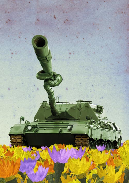
3. Colour the tank; in this case an olive green, using hue/saturation>colorize.
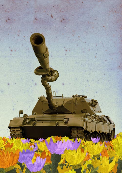
4. I want the tank tracks to look a little muddy over the green, so I duplicate the layer, colorize again to a muddy brown, and using a textured brush on a layer mask, paint out the brown I don't need, leaving the muddy tracks.
Step 13:
Gut instinct tells me that I want a mostly red tank, so I float a new tank layer, and use hue/saturation to change it to red. I then add a layer mask and paint out the areas that I want to look like the original tank (in this case the tracks, mirrors and undercarriage).
By painting out those areas on the layer mask, the original tank on the layer below shows through. Further colour tweaks of various areas are done in the same way.
Hot Tip: The layer mask is a great way of making changes without destroying the layer, and allows you to paint detail in or out, using any brush style, size or opacity. Layer masks are your friends - getto know them!

To get the red tank body, I duplicate the tank layer again, colorize to the red I want, and again use a layer mask to paint out what I don't want as red, thereby exposing the colour from the layer beneath.
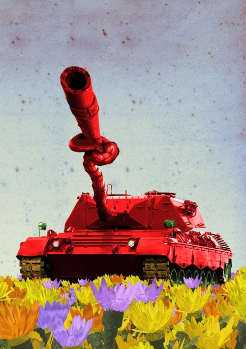
Just to add a bit of pop, I play with levels.
Step 14:
The background needs a texture, I think, so I place a scanned piece of old paper with really great foxing marks, and use hue/saturation to tweak until I like the colour, after which I use a, wait for it...layer mask to add a gradient.
Step 15:
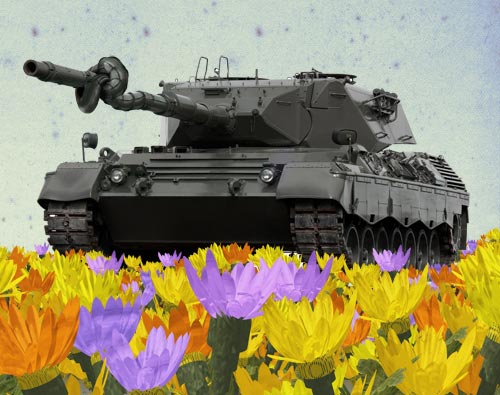
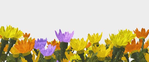
As part of the concept, I want to increase the sense of perspective that I've started with the protruding barrel, so decide to have the tank standing in a field of flowers.
The flowers I set up and rendered in the 3D program, Vue 6 Infinite, a landscape generating app with a rather nice render engine. After setting up the scene, getting the camera angles, focal length, composition and lighting to how I like, I render the flowers out on their own alpha mask.
Because these flower model objects are not designed for close up viewing, they end up giving me a nice graphic look... perfect for the feel of the poster. (I was going for more of a painted look rather than photographic).
Foreground flowers:
1. Set up, with appropriate perspective, light and render flowers in Vue 6 Infinite.
2. Using built-in alpha mask in Vue render, place the flowers in Photoshop tank document.
3. Float the flowers onto a number of different layers (in this case, 6),and transform>scale, and transform>flip>horizontal to get a sense of perspective with larger flowers in foreground, getting smaller closer to the tank. Also place some flower layers below the tank layer to add the impression that the tank is standing in a field surrounded by flowers.
4. Use the burn tool to darken areas of layers behind the top flower layer to add shadows and depth.
Step 16:
After saving the flower render in Photoshop, I select them and place them into my tank document, and play around a bit with the same image on various layers by scaling, flipping etc to get the sense of depth that I'm after.
Step 17:
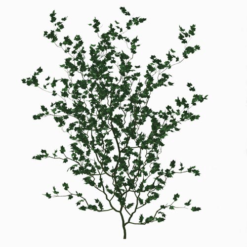
The branches sticking out from the barrel, are also 3D models rendered in Vue, placed in the Photoshop document, and transformed (warp,distort, scale etc) to get the shape I want.
Leaves in barrel:
1. Place and render foliage model (in this case, some ivy) in Vue 6 Infinite.
2. Place the foliage in the tank document, duplicate several layers,and use transform>warp to bend and shape to the desired "explosion" shape.
Step 18:
The dove is posed and rendered in Poser 6, and placed in the document.

Step 19:
All that remains is to choose the typeface, and to art direct it within the layout.
The final result:
 [view fullsize image]
 Barry is a designer from South Africa, and has reached the Top 10 in our Annual Photoshop contests several times.
Barry is working with major clients, ad agencies and publishers in the UK, USA, South Africa and Australia, as well as working on illustrated childrens books, creative concepts and other personal publishing projects. To find out more about Barry, visit his site
BarryDownard.
Related Posts
» Design Tutorial: Creating a Propaganda Poster» Photoshop Tutorial: Apocalyptic Christmas Card» Photoshop Tutorial: Creating the Hippie Tank