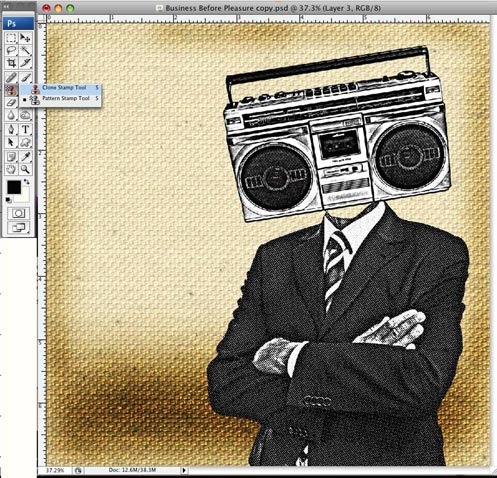
Step 5 - The Radio

Now open the radio and repeat the exact process you went through with the business man for the radio image.
If you want to save some time, you could set up a Photoshop Action to record what you did on the business man image and simply play this back to apply it to the radio image. The benefit of doing it manually is that you can fine-tune each process to ensure you achieve the exact look you are after.
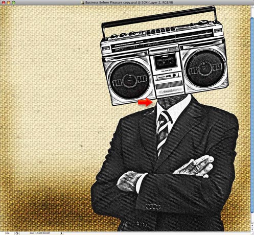
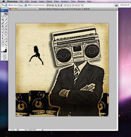
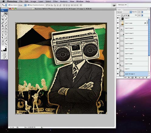
Copy and paste the radio image into your main artwork and use "Edit » Free Transform" to rotate, scale and move it to combine the radio with the business man figure just like you see here.
You will notice that there is now some empty space between the radio and the business man’s neck that we need to fill. Make sure you have the layer that the business man is on selected. Click the "Clone Stamp Tool" and set the "Brush" option in the top left corner to a diameter no larger than the man's Adam's apple. Place the curser on the Adam's apple, hold down "ALT" and click to sample this area. Next, click in the empty space to fill this in with the halftone feel of the figure's neck.
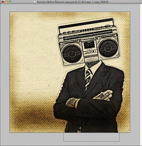
What you have should now look like this.
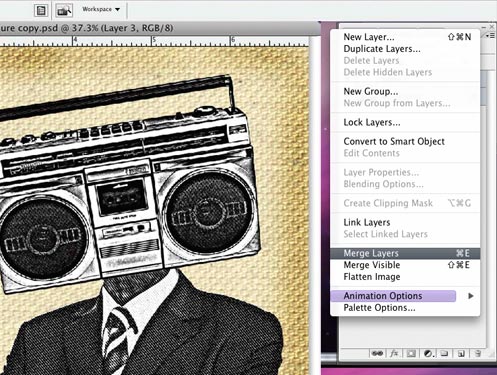
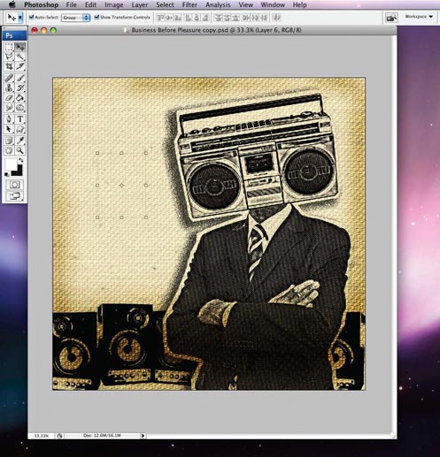
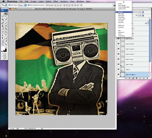
Now we will merge the two layers into one. Hold down the "Shift"" key and click on boththe radio and the business man layer in turn to select them in the layer panel. Next, access the layer drop-down menu from the little icon in the top right corner of the panel and select "Merge Layers".
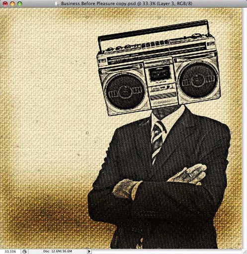
Click on the newly merged layer of the businessman and the radio, go to layer styles (the menu on top of the layers palette that usually reads "Normal") and change it to "Multiply". The white of the figure will become translucent like shown above.
Step 6 - Shadow and Speakers
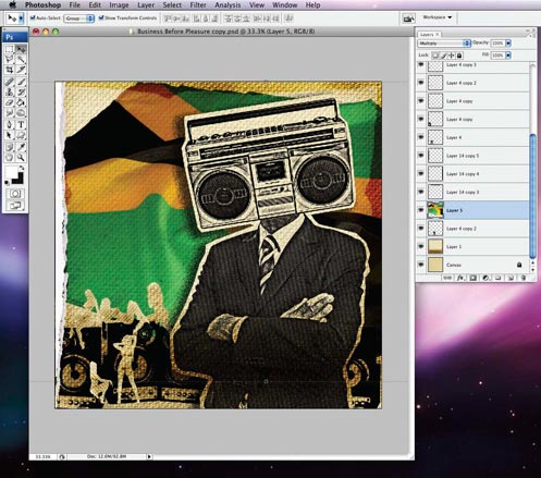
Duplicate the canvas layer and use the pen tool and create a path around the "radio man" as shown here (it does not have to be neat). Then, just like we did earlier, turn the path into a selection. Press command + shift + L (ctrl + shift + L) to invert the selection (or access the function from the "Select" menu. Make sure you have the duplicated canvas layer selected and hit delete.

You won’t see the results instantly, since the first canvas layer is identical to the areas you just deleted , but fret not. Go down to the "FX" button in the layers panel and select "Drop Shadow".
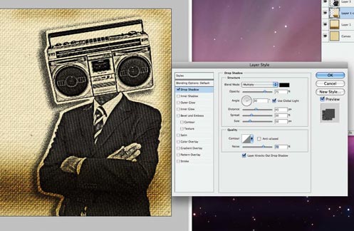
In the "Drop Shadow" dialogue box, adjust the settings until you have something that looks similar to this. The shadow will help make him the focal point of the piece. Add some noise to the shadow to give it that halftone/screen printed feel. The radio man is a bit off centre, so that we can expose the background which helps to tell the story, which is also another characteristic of Jamaican album cover design.
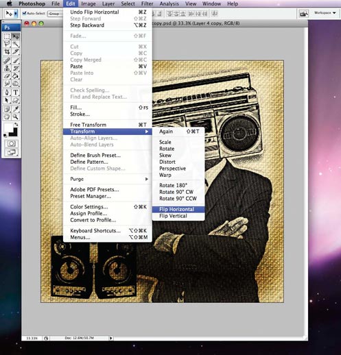
Now, let's add some loud speakers. You can get yours from Crestock or from any other image source. Once you have your speakers, you can repeat the same process we used for "Mr Music' to give the speakers a similar look. Next, duplicate one speaker, then go to "Edit » Transform » Flip Horizontal". This will flip the speaker, thus creating the illusion that these are two different speakers. We'll set these layers to "Multiply" too, so the background is visible through them.
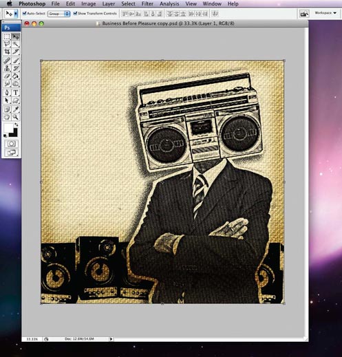
We continue this illusion by duplicating our two different speaker images a few times, making some of them bigger or smaller and alternating the appearance of each speaker. Create a line of speakers across Mr Music and then move all the speaker layers behind him. You will notice that the speakers are darker than Mr Music, which coupled with the canvas outline and the shadow give our piece some depth.
Step 7 - Girls as Canvas
Now we find a sexy lady silhouette image, and duplicate the background canvas layer again. We then create a selection around the sexy lady silhouette, click on the duplicated canvas and do a copy + paste. You will see another layer appear above the duplicated canvas layer, containing a cut-out of the lady silhouette. Leave that layer alone for now and hide the duplicated canvas layer and the original sexy lady layer.
Due to her being the same color as the background, you might not be able to see her unless you hide the background canvas. You can use the burn tool again to darken this figure, after which you should be able to see her better.
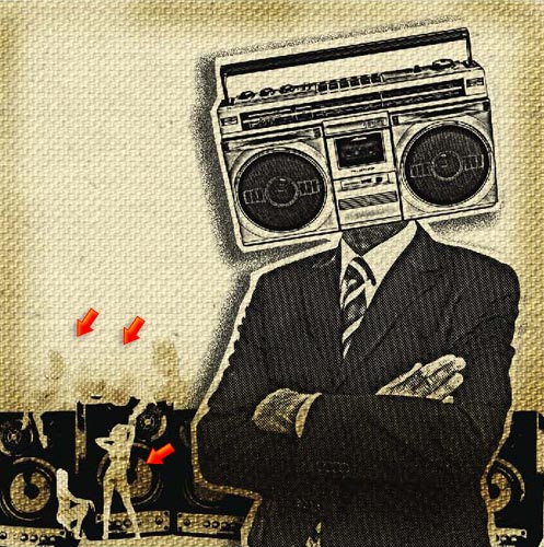
Repeat this process with girls in other poses and lay them out according to how you would like it.
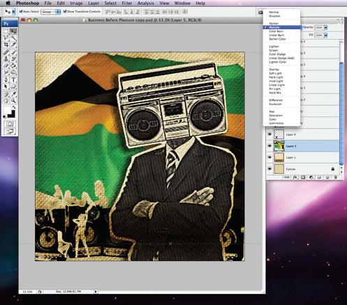
Get a Jamaican flag, one with some wrinkles (for added texture and interest) and place it on the background just above the canvas layer. Go to layer blending options and set it to multiply.
Step 8 - Torn Edges
Get some torn edges, or scan some in, and place them around the edges of the piece.
Set the layer blending mode for the torn edge layers to overlay. They will become slightly transparent, thus adding more layers of depth to the piece and giving it a mildewed feel.
Now get another torn edge that looks as three dimensional as possible and place it on the right side of the piece.
Step 9 - Adding Type

Now we add our type. I laid the type on the middle of the main figure to give it primary prominence. Mr Music has secondary prominence but both image and type work together to create a visual impact. If you look closely at the angle of the type, you'll see that it is set to compliment the line created by the folded arms of our radio man, almost making the type part of his body.
The main typeface used was Hotel Coral Essex. I used it for its boldness, and for the distressed yet refined feel it gives to the piece, communicating the message clearly. The other typeface, used for the "Vol.1" text, is Levi Brush. This typeface was chosen to compliment the main typeface.
Step 10 - The Finishing Touches

Now for the final touches. We want give the artwork that really old feel, we want it to feel like this is an album we’ve owned for years and it's been worn, scratched and used. We need to get some black sand paper or black matte board and scratch it and scrape it.
The wounds will appear white when you distress the black matte board. Scan or photograph the whole thing, then simply add the images of the scratch and damaged pieces of matte board to your image. Go to the layer blending mode menu and choose the screen setting. The black will disappear leaving just the white distressing. This will give your piece some added authenticity.
To get the lipstick on his collar just search around for a good lipstick illustration, until you find the lips that you like the best.
The final piece

View Larger
About the Artist:
David is a graphic designer from Portmore, Jamaica. He's also the winner of the first round of the Crestock Photoshop Contest 2008.
Related Posts
» Design Tutorial: Creating a Propaganda Poster» Photoshop Tutorial: Modern Eve» Photoshop Tutorial: Apocalyptic Christmas Card» Photoshop Tutorial: Gift for Tomorrow